
Your home’s exterior is its public face, the first thing that welcomes guests and greets you at the end of the day. What message do you want it to send? Are you aiming for a peaceful retreat, a cheerful gathering place, or a sophisticated modern statement? The colors you choose are your primary tool for telling that story. A well-thought-out palette can highlight beautiful architectural details, downplay less attractive features, and create a cohesive look that feels intentional and polished. The search for the best colour combination for house exterior is about crafting that perfect first impression, and we’ll show you how to get it right.
Key Takeaways
- Follow the 60-30-10 Rule for a Balanced Palette: Use a dominant color for 60% of your home (siding), a secondary color for 30% (trim), and an accent for 10% (the front door). This simple formula creates a professional, cohesive look that works with your home’s existing features like its roof or brick.
- Always Test Paint Samples on Your Home: A paint chip looks different in real life. Paint large swatches and observe them on your home’s exterior in morning, afternoon, and evening light to see how the color truly behaves before you commit to the entire house.
- Invest in High-Quality Paint for Lasting Results: Premium paint is your home’s first line of defense against the weather. It provides better coverage and resists fading and cracking, which protects your investment and saves you from having to repaint in just a few years.
Understanding Your Home’s Exterior Color Psychology
Choosing an exterior paint color feels like a huge commitment, and it is! It’s the first impression your home makes, and it sets the tone for everything inside. But color is more than just a matter of personal taste; it has a powerful psychological impact. The shades you choose can influence how you and your neighbors feel about your home, reflect your personality, and even play a role in its market value. Think of your home’s exterior as its outfit—you want it to be stylish, appropriate for the setting, and a true reflection of what’s on the inside.
Understanding the psychology behind color can help you move from feeling overwhelmed by paint chips to feeling confident in your choice. It’s about creating a feeling, not just picking a color. Whether you’re aiming for a home that feels like a peaceful retreat, a cheerful gathering place, or a sophisticated modern statement, the right palette can make all the difference. Our design and build services always start with this conversation, because getting the color right is fundamental to creating a space you’ll love for years to come. Let’s explore how color choices can shape perception and add value to your home.
How the Right Exterior Colours Boost Property Value
If you have any plans to sell your home down the road, your exterior color choice is a financial decision. While you should always pick a color you love, keeping resale value in mind is just plain smart. Neutral colors tend to have the broadest appeal because they act as a blank canvas, allowing potential buyers to easily envision themselves living there. Shades of white, from crisp modern white to creamy off-white, give a home a fresh, clean look that’s timeless. Similarly, gray has become a go-to for a sophisticated and contemporary feel. These colors don’t just look good; they help your home appeal to more buyers, which can be a major advantage in a competitive market.
Choosing Colours for the Chicago Climate
Your home doesn’t exist in a bubble. Its surroundings—from the color of your roof and any existing brick or stone to your landscaping—should guide your palette. A good rule of thumb is to identify the undertones in these fixed elements. If your roof and stonework have warm, earthy tones, leaning into warm paint colors will create a harmonious look. If they’re cool, like a gray slate roof, cool-toned paints will feel more cohesive. Here in Chicagoland, we also have to think about our distinct seasons. A color can look dramatically different under the bright summer sun than it does on a gray winter day, so be sure to test your paint samples in various lighting conditions.
How Colors Influence Mood and Perception
The color of your home sends a message. What do you want yours to say? Warm colors like soft yellows, beiges, and earthy reds tend to feel welcoming, cozy, and energetic. They can make a house feel like a cheerful and inviting place. On the other hand, cool colors like blues, greens, and grays create a sense of calm and tranquility. These shades can give your home a peaceful, serene vibe, turning it into a relaxing retreat from the hustle and bustle. Thinking about the mood you want to create can be a great starting point for narrowing down your options and ensuring your home renovation truly reflects your lifestyle.
Color Palettes for Every Architectural Style
Your home’s architectural style is one of the best guides for choosing an exterior color palette. Certain colors naturally complement specific designs, highlighting unique features and creating a cohesive look. Whether you live in a sleek modern build or a classic Chicago bungalow, letting the architecture lead the way ensures a timeless and fitting result. Understanding how color works with your home’s structure is a key step in any home renovation project, ensuring the final look is both beautiful and harmonious.
Modern Homes: Clean Lines and Bold Contrasts
Modern architecture is all about simplicity, clean lines, and a “less is more” philosophy. To honor this style, stick with a color palette that feels crisp and intentional. High-contrast combinations are particularly effective. Think of a striking white siding paired with bold black trim to accentuate the home’s geometric shapes. This creates a sharp, sophisticated look that feels both current and enduring. Other great options include monochromatic schemes with varying shades of gray or charcoal. These home exterior ideas let the structure speak for itself without overwhelming visual clutter.
Traditional Colonial: Classic Elegance
Colonial homes have a timeless, symmetrical beauty that calls for a classic color scheme. You can’t go wrong with neutral bases like crisp white, soft beige, or light gray for the main body. These colors respect the home’s historical roots while providing a clean canvas. To add personality, choose a contrasting trim in a darker neutral or add a vibrant accent color to the front door. A deep navy, a cheerful red, or a stately black door can provide the perfect focal point. This approach maintains the home’s elegant character while giving it a fresh, welcoming feel that reflects your personal style.
Craftsman Style: Natural Earth Tones
Craftsman homes are known for their sturdy construction, natural materials, and connection to the outdoors. The best color palettes for this style draw inspiration directly from nature. Think rich, earthy tones that ground the home in its landscape. Deep forest greens, warm browns, and muted olive tones are excellent choices for the main siding. These colors pair beautifully with the wood and stone details common in Craftsman architecture. For the trim, consider cream, deep brown, or even black to create a sophisticated, natural aesthetic that feels both cozy and distinguished.
Victorian: Rich and Ornate
Victorian homes are the opposite of minimalist—they celebrate intricate details, from decorative trim to complex rooflines. Your color palette should do the same. This is your chance to be playful and use multiple colors to highlight your home’s unique personality. Historically, these homes were painted in rich, deep hues. You can create a lively, energetic feel with bold color combinations like buttery yellow, sky blue, and crisp white trim to make every detail pop. Don’t be afraid to use three, four, or even five colors to accentuate gables, brackets, and window casings.
Coastal Homes: Breezy and Light
You don’t need to live by the ocean to enjoy a breezy, coastal-inspired home. This style is all about creating a light, airy, and relaxed atmosphere. The color palette should reflect that with soft, sun-bleached hues. Think light blues, seafoam greens, sandy beiges, and plenty of crisp white. This coastal-inspired palette works beautifully on a variety of home styles, from cottages to more traditional builds. The goal is to create a serene and welcoming exterior that feels like a permanent vacation, even right here in Chicagoland.
How to Create Your Exterior Colour Scheme
Choosing an exterior color scheme can feel like a huge decision, but you don’t have to be an artist to get it right. The key is to break it down into manageable pieces. Instead of looking at the whole house at once, think about it as a collection of components: the main body, the trim, the doors, and the fixed elements like your roof or brick. By tackling each part one by one, you can build a cohesive and beautiful palette that feels uniquely you. This approach turns an overwhelming task into a creative project, ensuring every element works together to create stunning curb appeal.
Choose Your Main Body Color
This is the star of the show—the color that will cover the most surface area on your home’s siding. It sets the overall tone, so it’s the best place to start. Think of this as the foundation of your entire color scheme. Whether you’re drawn to a timeless neutral, a soft pastel, or a deep, moody hue, this color will anchor all your other choices. Don’t worry about the smaller details just yet. Focus on finding a main color that you love and that complements your home’s architectural style.
Select Trim and Accent Colors
Once you have your main color, it’s time to choose its supporting cast. Trim includes the features that frame your house, like window and door casings, fascia boards, and eaves. A classic approach is to use crisp white trim, which works with almost any main color to create clean lines and make windows appear larger. For a more modern or dramatic look, you could opt for a dark, contrasting trim. These accent colors add depth and dimension, and you can see how different combinations play out in our project gallery.
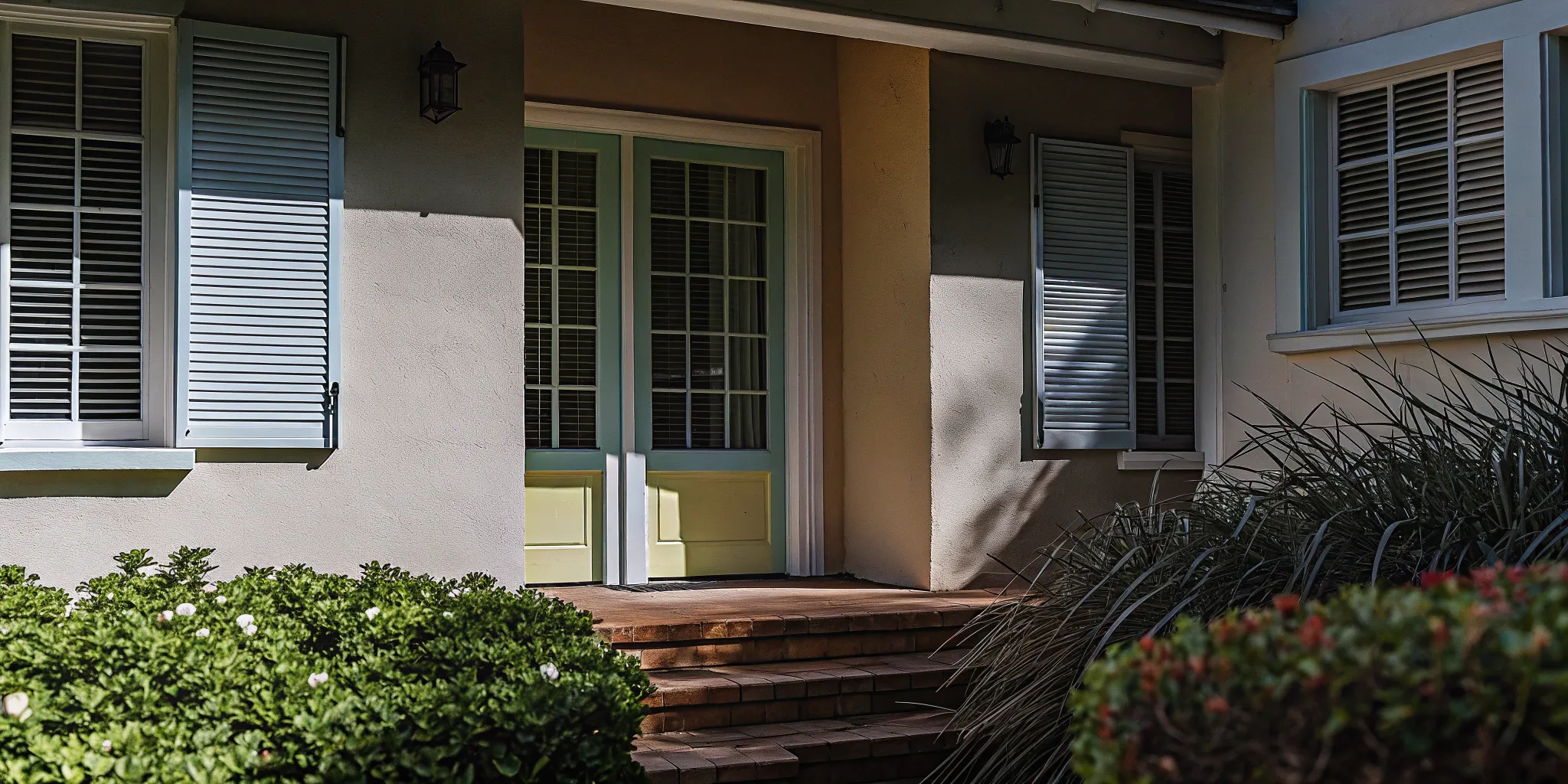
Pick Your Door and Shutter Colors
Your front door is the perfect place to inject some personality. Think of it as a statement piece that welcomes guests into your home. A bright, bold color can create a cheerful focal point and add a lot of character without overwhelming the entire house. Shutters can either match the trim for a traditional look or coordinate with the door for an extra pop of color. This is your chance to have a little fun and choose a shade that truly makes you smile every time you pull into the driveway.
Coordinate with Your Roof Color
Your roof is one of the largest and most permanent features of your home’s exterior, so it’s essential that your paint colors work with it, not against it. Take a close look at your shingles. Do they have warm undertones like brown, red, or tan? If so, stick with warm paint colors. If your roof is a cooler shade of gray, black, or blue, then cool-toned paints will create a more harmonious look. Coordinating with your roof ensures your entire home renovation looks intentional and professionally designed.
Work with Existing Stone or Brick
Just like your roof, any existing stone or brick on your home is a fixed element that you need to consider. These materials have their own unique color palettes, and the best approach is to take inspiration from them. Look for subtle undertones within the stone or brick—you might find flecks of gray, tan, or even a muted plum. Pulling one of these colors out to use for your siding or trim is a surefire way to create a cohesive and sophisticated exterior that looks completely put-together.
How to Choose Your Colors Wisely
Picking the right exterior colors can feel like a huge commitment, but it doesn’t have to be overwhelming. With a bit of strategy, you can confidently land on a palette that you’ll love for years to come. It’s about more than just picking a color you like; it’s about creating a balanced, harmonious look that complements your home’s architecture and its surroundings. These practical steps will help you move from inspiration to a final decision, ensuring your home’s exterior looks intentional and beautifully put together.
Apply the 60-30-10 Rule
If you’re looking for a foolproof way to create a balanced color scheme, start with the 60-30-10 rule. This classic design principle is simple to follow and delivers professional-looking results. Here’s the breakdown: 60% of your exterior should be your dominant color, which is typically the siding. 30% is a secondary color for features like trim, gables, or garage doors. The final 10% is your accent color, reserved for the front door, shutters, or other small details where you want to add a pop of personality. This formula prevents any single color from overpowering the others and creates a cohesive, layered look.
Test Colors in Different Lighting
Paint colors can be chameleons. A shade that looks perfect on a small paint chip in the store can appear completely different on the side of your house. The amount and type of light your home gets will dramatically affect how a color looks. A north-facing home receives less direct light, which can make colors appear cooler and darker. To get a true sense of a color, you need to see how it changes throughout the day. Paint large sample swatches directly on your home—on both a sunny and a shady wall—and observe them in the morning, afternoon, and evening before making your final choice.
Use Digital Tools to Visualize Colors
Sometimes it’s hard to imagine how a whole new color palette will look on your home. Luckily, you don’t have to guess. Many major paint brands offer digital tools that let you preview colors on a photo of your own house. For example, you can upload a picture to a Paint Color Visualizer tool and experiment with different combinations for the body, trim, and accents. While it’s not a perfect substitute for real-life paint samples, it’s an excellent way to narrow down your options and see which direction you want to go before you even buy a sample pot.
Consider Your Neighborhood’s Style
Your home is part of a larger community, and its exterior color should feel like it belongs. Take a walk around your neighborhood and notice the color palettes on other homes. You don’t need to match your neighbors, but you should aim for a look that complements the overall aesthetic of the street. Also, consider your home’s architectural style. Certain color combinations are a natural fit for specific designs—think earthy tones for a Craftsman or classic neutrals for a Colonial. Choosing colors that honor your home’s character will always result in a more timeless and appealing look.
Think About How Colors Look Year-Round
Here in Chicagoland, our scenery changes dramatically with the seasons. A color that looks stunning against the lush green of summer might feel stark against a blanket of snow or the bare branches of winter. Colors found in nature—like deep greens, warm browns, and muted earth tones—tend to look great in any season. When you’re testing samples, try to picture them against different seasonal backdrops. This ensures your home looks welcoming and harmonious all year long, not just for a few months. It’s a simple consideration that makes a big difference in your long-term satisfaction.
Why Choosing the Best Exterior Paint is Crucial
Once you’ve landed on the perfect color combination, the next crucial step is selecting the right paint. The quality of your exterior paint is just as important as the color itself. Think of it as a protective shield for your home—it’s your first line of defense against weather, moisture, and time. A high-quality paint job not only looks fantastic but also preserves the integrity of your siding and trim, saving you from costly repairs down the road. Investing in a great product from the start ensures your beautiful new color scheme will last for years.
Explore Top Paint Brands
Walking down the paint aisle can be overwhelming, but not all cans are created equal. While brands like Sherwin-Williams, Benjamin Moore, and Behr are household names, it pays to look at how different products perform in real-world conditions. For instance, one comprehensive experiment found that PPG Permanizer was a standout choice for its durability. Doing a little research on specific product lines can make a huge difference. Look for paints with high ratings for coverage and longevity to ensure you’re getting the best value and a finish that will hold up over time.
Look for Weather-Resistant Formulas
Here in Chicagoland, our homes face everything from blazing summer sun to icy winters. That’s why choosing a weather-resistant formula is non-negotiable. The best exterior paints are designed to be flexible, which helps prevent cracking and peeling as your home expands and contracts with temperature changes. Excellent cracking resistance is especially important, as it protects your home’s underlying materials from water damage. When you select exterior paint formulated to withstand harsh conditions, you’re ensuring your home stays protected and looks great no matter what the forecast holds.
Follow Application Best Practices
Even the most expensive, highest-quality paint will fail if it isn’t applied correctly. Proper prep work—including cleaning, scraping, and priming—is the foundation of a lasting paint job. Beyond that, technique matters. For example, research shows that applying multiple coats can significantly reduce fading, which is particularly noticeable with certain colors like deep blues and reds. This is where professional expertise really shines. A skilled team knows how to prepare surfaces and apply paint for maximum adhesion and a flawless, durable finish that enhances your home’s curb appeal.
Plan for Long-Term Maintenance
A freshly painted home looks incredible, and you’ll want to keep it that way for as long as possible. While top-tier paints are designed for longevity, a little upkeep goes a long way. It’s wise to plan for long-term maintenance from the start. This can be as simple as gently washing your home’s exterior every year or two to remove dirt and grime. It’s also a good idea to do a walk-around inspection periodically to check for any small chips or cracks that need a quick touch-up. Addressing minor issues early prevents them from becoming bigger problems and extends the life of your paint job.
Expert Tips for the Perfect Exterior Colour Palette
Choosing the right exterior paint colors can feel like a huge decision, but it’s also one of the most exciting parts of a home renovation. A well-chosen palette not only protects your home but also expresses your personal style and makes your property shine. Getting it right comes down to a little planning and a few pro-level tricks. From knowing when to call for backup to testing your swatches the right way, these tips will help you create a look you’ll love for years to come.
Thinking through your color strategy is a key part of any major exterior project. Whether you’re updating siding or planning a full-scale addition, the final coat of paint is what ties everything together. If you’re looking for guidance on the entire process, our design and build services integrate color selection into a cohesive plan, ensuring every detail works in harmony. Let’s walk through how to approach your color choices with confidence.
When to Hire a Color Consultant
If you find yourself staring at hundreds of paint chips and feeling completely stuck, you’re not alone. This is the perfect time to consider hiring a color consultant. A professional can offer a fresh perspective and help you sort through the endless options to find a palette that complements your home’s architecture and your personal taste. They understand color theory and how light affects perception, which can save you from making a costly mistake. Think of it as a small investment to ensure the final result is exactly what you envisioned.
How to Properly Test Paint Samples
Never commit to a color based on a tiny paper swatch. The best way to test is to paint large samples on white foam boards. This allows you to move the samples around your home’s exterior without painting directly on your current finish. Check the colors at different times of day—morning, noon, and late afternoon—to see how they change in the light. It’s also smart to view them on both sunny and cloudy days. Don’t forget to step back to the curb and see how the colors look from a distance. This process gives you the most accurate preview of the final look.
Avoid These Common Color Mistakes
One of the most frequent missteps is choosing colors in isolation. Remember to consider how your main color, trim, and accents will look together. A color that’s beautiful on its own might clash with your roof or brickwork. Another common mistake is underestimating the impact of natural light. A soft gray that looked perfect in the store can appear washed out in direct sun or dreary in the shade. Always test your colors on-site. Finally, don’t forget about your home’s permanent features. Your palette should harmonize with any existing stone, brick, or roofing materials.
Highlight Your Home’s Best Features
Your home’s exterior color scheme is a powerful tool for accentuating its best architectural details. Use contrasting colors to make features like trim, shutters, and gables stand out. A crisp white trim against a darker body color, for example, creates a classic, defined look. The front door is another fantastic opportunity to add a pop of personality. A bold or unexpected color can create a welcoming focal point and significantly improve your home’s curb appeal. You can see great examples of this in our project gallery, where color is used to bring out the unique character of each home.
Timeless Exterior Colour Palettes That Always Work
Choosing an exterior color for your home can feel like a huge commitment. You want something that reflects your personal style but also has lasting appeal. Trends come and go, but a timeless color palette ensures your home looks beautiful for years to come, which is a smart move for both your enjoyment and your property value. These classic combinations work with a wide range of architectural styles, from historic bungalows to modern new builds, making them a safe yet sophisticated bet.
The key to a timeless look is leaning into colors that feel classic and versatile. Think of neutrals that work well with natural materials like stone and brick, or classic pairings that have stood the test of time. A well-chosen palette can highlight your home’s best features and create a welcoming first impression. When you’re ready to transform your home’s exterior, exploring our gallery of completed projects can provide plenty of inspiration. A thoughtful color choice is the foundation of any great home renovation, setting the tone for the entire property.
Classic White and Black
You simply can’t go wrong with a black and white color scheme. It’s crisp, clean, and eternally stylish. This high-contrast look is incredibly versatile, looking just as sharp on a modern home with clean lines as it does on a traditional colonial. A popular approach is to use white for the main siding and black for the trim, shutters, and window frames to create a striking, graphic effect. For a slightly softer feel, you could use a creamy off-white as your base. This palette also provides the perfect neutral backdrop for a bold front door in a color like cobalt blue or vibrant red, adding a pop of personality that’s easy to change later.
Warm Earth Tones
If you want your home to feel grounded and inviting, warm earth tones are an excellent choice. This palette draws inspiration from nature, using shades of beige, tan, taupe, and warm off-whites to create a welcoming and harmonious look. These colors are particularly effective when paired with natural materials like wood accents or a stone facade, as they enhance the organic texture and warmth. An earthy palette feels both traditional and modern, offering a soft, subtle look that blends beautifully with the surrounding landscape. Our design and build services can help you select the perfect combination of colors and materials to achieve this cozy, sophisticated aesthetic.
Cool Gray Schemes
Gray has become a go-to neutral for a reason—it’s incredibly sophisticated and adaptable. The options range from light, airy grays that feel fresh and modern to deep, dramatic charcoals that add a sense of moody elegance. A popular choice is “greige,” a perfect blend of gray and beige that offers warmth and versatility, pairing beautifully with either crisp or soft white trim. A cool gray palette provides a clean, contemporary look that highlights architectural details without overwhelming them. It’s a fantastic choice for homeowners who want a modern yet timeless exterior that feels both calm and confident.
Heritage Colors
For a home with character and depth, consider heritage colors. These are deep, saturated hues like navy blue, forest green, and rich burgundy that evoke a sense of history and permanence. These bold choices add drama and sophistication, making a memorable statement from the curb. Heritage colors work especially well on older homes, enhancing their historic charm, but they can also bring a chic, modern edge to new construction. To keep the look balanced, pair these deep body colors with a crisp white or cream trim to create a clean contrast that makes the main color pop. This approach is perfect for a home addition where you want to create a seamless yet distinguished look.
Contemporary Neutral Pairings
A modern take on neutrals goes beyond a single shade and focuses on creating a layered, textured look. Think about pairing several complementary neutrals, like a soft taupe body with a slightly deeper greige for the trim and a warm off-white for accents. This monochromatic approach creates a subtle, sophisticated exterior that is rich with dimension. It’s a minimalist-inspired style that feels calming and incredibly chic. By sticking to a family of related neutral tones, you ensure a cohesive and elegant result that will never look dated. As an award-winning company, we’ve seen how these thoughtful pairings can completely transform a home’s presence.
Why Paint Quality is Key to a Lasting Finish
Choosing the perfect exterior color is exciting, but the actual quality of the paint you use is what truly protects your investment and keeps your home looking beautiful for years. Think of it as the difference between a flimsy raincoat and a durable, all-weather jacket. While premium paint might cost more upfront, it’s one of the smartest decisions you can make for your home’s exterior. High-quality paint offers superior coverage, which often means fewer coats are needed, saving you time and labor costs.
More importantly, top-tier paints are formulated with better ingredients—like binders and pigments—that create a tougher, more flexible, and more resilient finish. This durable shield is your home’s first line of defense against Chicago’s demanding weather, from blistering summer sun to freezing winter storms. A quality paint job resists fading, cracking, and peeling, which means you won’t have to worry about repainting every few years. It’s not just about aesthetics; it’s about protecting the structure of your home and maintaining its value. When you invest in a full home renovation, using quality materials from start to finish ensures the results are both stunning and long-lasting.
What Makes Paint Weather-Resistant?
In Chicagoland, your home’s exterior paint has a tough job. It needs to stand up to intense UV rays, heavy rain, humidity, and snow. The most critical feature of a good exterior paint is its ability to resist cracking. As experts at Consumer Reports note, cracks in the paint film expose your home’s siding to moisture, which can lead to rot, mold, and costly structural damage. The best exterior paints are formulated with flexible binders that expand and contract with temperature changes, preventing those tiny fissures from forming. They also contain additives that resist mildew growth and pigments that are less likely to fade over time, keeping your chosen color vibrant and true.
Understanding Paint Coverage and Finish
When we talk about paint coverage, it’s not just about how much square footage a single can will cover. It’s also about hiding power. A high-quality paint has a higher concentration of solids and premium pigments, allowing it to cover the old color more effectively in fewer coats. This saves significant time and money on your project. The finish, or sheen, also plays a big role. Different sheens are suited for different surfaces; for example, a low-lustre or satin finish is a popular choice for siding because it’s durable and easy to clean without being overly shiny. You can find great exterior color inspiration that also helps you pick the right finish for each part of your home.
Balancing Cost and Quality
It can be tempting to choose a less expensive paint to cut down on project costs, but this is almost always a mistake in the long run. Cheaper paints often require more coats for decent coverage and begin to fail much sooner, leading to peeling, fading, and chalking within just a few years. You’ll end up spending more on repainting than you would have by simply choosing a better product from the start. While the most expensive option isn’t always necessary, investing in a reliable, well-formulated paint offers far better longevity and satisfaction. It’s about finding the right balance of performance and price to ensure your beautiful new exterior stands the test of time.
Colour Strategies for Specific Parts of Your Home
Breaking down your home’s exterior into individual components makes the color selection process much more manageable. Instead of looking at the entire house as one giant canvas, think of it as a collection of features—each offering a unique opportunity to add character and style. By thoughtfully choosing colors for your door, trim, and other details, you can create a cohesive and polished look that truly reflects your personal taste and enhances your home’s best features.
Make Your Entry Door a Focal Point
Your front door is the first welcome your home extends to guests, so why not make it memorable? This is the perfect place to be a little daring with color without committing to a bold choice for your entire exterior. A brightly painted door creates an instant focal point and injects a dose of personality. Think about using an unexpected shade like a cheerful mustard yellow, a deep cobalt blue, or a vibrant paprika red to draw the eye. These inviting curb appeal ideas can make your entrance stand out. A fresh coat of paint on the front door is a simple weekend project that delivers a major impact, setting a stylish tone for the rest of your home.
Choose Colors for Trim and Shutters
Trim and shutters are like the frame for your home’s artwork—they define the edges and make everything else pop. A classic, crisp white trim is a timeless choice that works with nearly any main body color. It helps highlight architectural details and can even make your windows appear larger and more prominent. For a more subtle, contemporary feel, you could paint the trim a few shades darker than your main color. If you want a bolder look, choose a contrasting accent color for your shutters that complements both the siding and the trim. You can see beautiful examples of how trim completes a home’s look in our project gallery.
Accentuate Porches and Details
The small details are what give a home its unique character. Pay attention to elements like porch ceilings, columns, railings, and gables. The color choices here should align with your home’s architectural style. For instance, traditional homes often look best with classic, muted tones, while modern designs can handle more dramatic contrasts. A classic Southern tradition is to paint a porch ceiling a soft “haint blue” to mimic the sky and create a relaxing atmosphere. Highlighting these features is a key part of any quality home renovation, as it adds depth and charm that makes a house feel truly special.
Decide on a Garage Door Color
Garage doors often take up a significant amount of visual space, yet they’re frequently an afterthought. Painting your garage door is an easy and affordable way to make a big difference in your home’s overall appearance. You generally have two options: help it blend in or make it stand out. Painting the garage door the same color as your home’s siding will make it recede, allowing other features like your front door to take center stage. Alternatively, you can treat it as an accent by painting it the same color as your trim or shutters for a cohesive, pulled-together look. Check out these home exterior ideas for more inspiration.
Related Articles
- Autumn Allure: Welcoming Fall into Your Home
- Embrace the Season: Why Fall is the Ideal Time for Kitchen Remodeling
- Twinkling Lights, Warm Nights: Creating a Holiday Haven with THP Builders
- Blog | THP Builders LLC
- Blog Archives –
Frequently Asked Questions
I’m worried about resale value. Do I have to stick with boring beige? Not at all! While it’s true that neutral colors have the widest appeal, “neutral” doesn’t have to mean “boring.” Sophisticated grays, warm off-whites, and earthy “greige” tones all act as a beautiful blank canvas for potential buyers while still feeling modern and stylish. If you love color, the front door is the perfect place to make a statement. A bold door is an easy and inexpensive thing for a new owner to change if they want, so you can add that personal touch without affecting your home’s broader appeal.
Where’s the best place to start if I feel completely overwhelmed? The best first step is to look at the parts of your home you can’t change. Take a close look at the undertones in your roof, brick, or any stonework. Do they lean warm (brown, tan, red) or cool (gray, black, blue)? Figuring this out will immediately cut your paint chip options in half and give you a clear direction. Once you know your color family, you can start looking for a main body color within that palette that you truly love.
My roof and brick have fixed colors. How do I make sure my new paint doesn’t clash? The key is to find a color that harmonizes with, rather than fights against, your existing materials. Look closely at your brick or stone and identify the different flecks of color within it. You might be surprised to find subtle shades of gray, cream, or even deep plum. Choosing one of these undertones for your main siding color is a foolproof way to create a cohesive, professionally designed look. This ensures your new paint feels like a natural extension of your home’s original character.
Why can’t I just pick a color from a small paint chip? Is testing it on the house that important? Yes, it’s absolutely essential! A small paper chip can’t show you how a color will change in different lighting conditions. The light on the shady side of your house is very different from the direct afternoon sun, and a color can look dramatically different in each. Painting large test swatches and observing them throughout the day is the only way to be certain you’ll love the final result. It’s a small step that saves you from the major headache of repainting an entire house.
What if I don’t like the traditional colors for my home’s architectural style? Your home should be a reflection of you, so you should always choose a color you love. The guidelines for architectural styles are just that—guidelines, not strict rules. If you have a Colonial home but aren’t a fan of classic white, you could try a sophisticated deep navy or a warm gray instead. The trick is to honor the spirit of the style while updating the palette. You can often achieve this by keeping the color relationships traditional (like using a lighter trim) even if the specific colors are more modern.