
We’ve all heard the horror stories. A homeowner picks a lovely, subtle gray from a tiny paint chip, only to find it looks like a jarring baby blue on the entire house. Choosing an exterior paint color is a huge commitment, and the fear of getting it wrong is real. The good news? Most common painting mistakes are completely avoidable. From forgetting to test colors in different light to picking a trendy shade that won’t last, we’ll cover the pitfalls to sidestep. This guide gives you a clear process for finding the best exterior paint colors you’ll love for years to come.
Key Takeaways
- Work with your home’s fixed features, not against them: The most successful color palettes complement existing elements like your roof color, brick or stone accents, and window frames. Taking these into account first ensures a cohesive and polished final look.
- Choose the right paint formula for durability: Beyond color, the type of paint and its finish are critical for a long-lasting result. A quality acrylic latex paint is often best for Chicago’s weather, while the right sheen can hide imperfections or make trim details pop.
- Sample your top colors to avoid surprises: Never commit to a color based on a small paint chip. Paint large test swatches on different sides of your home and watch how they change in the morning, noon, and evening light to ensure you love the color in every condition.
Which Paint Brands Do Pros Recommend?
Picking the right paint color is exciting, but the brand you choose is just as important for getting a beautiful, long-lasting finish. The quality of the paint affects everything from how easily it applies to how well it stands up to Chicago’s weather. Different brands have their own strengths, whether it’s a massive color selection, superior durability, or great value. As a contractor, we work with many top brands and have seen firsthand what works best. Here’s a look at four of the most trusted names in the industry to help you decide.
Sherwin-Williams: Top Pick for Color and Quality
Sherwin-Williams is a go-to for a reason. They offer a huge selection of exterior paint colors, from timeless classics to modern, bold shades that let you express your personal style. One of the best things they offer is the Sherwin-Williams Paint Color Visualizer tool. This feature is incredibly helpful because it lets you upload a photo of your own home and test out different colors before you commit. It takes a lot of the guesswork out of the process and helps you feel confident that you’re making a choice you’ll love for years to come. Their paints are known for their quality, coverage, and durability, making them a solid investment for any home exterior project.
Benjamin Moore: For Rich Colors That Last
If you’re focused on rich color and a finish that will last, Benjamin Moore is an excellent choice. They are masters at creating paints that not only look fantastic but also provide a strong, protective layer for your home. Benjamin Moore offers several high-quality exterior paints designed to withstand harsh weather, which is a must in our area. Their colors are known for their depth and resistance to fading, so your home’s curb appeal will stay fresh season after season. Choosing a durable paint like this means less maintenance for you down the road and a beautiful finish that truly protects your home. It’s a brand that consistently delivers on both performance and appearance.
Advanced Paint Technology for Durability
It’s easy to think of paint as just color, but the science behind it is what really protects your home. Top brands invest heavily in technology to make their exterior paints tougher and longer-lasting. For instance, Benjamin Moore’s Aura® Exterior paint features special Color Lock® technology designed to keep colors rich and prevent them from fading over time. This kind of innovation means the paint is engineered to resist cracking, peeling, and mildew, even when faced with Chicago’s harsh winters and humid summers. Choosing a paint with these advanced properties ensures your home not only looks great on day one but continues to look fresh for years, saving you time and money on future maintenance.
Behr: Quality Paint That Fits Your Budget
Behr proves that you don’t have to spend a fortune to get a high-quality result. Known for being both durable and affordable, Behr is a popular choice for homeowners who want to refresh their home’s exterior without a premium price tag. You can find their products at The Home Depot, making them incredibly accessible. Their exterior paint and primer-in-one options are especially popular because they save you time and effort during application. Behr offers a wide range of colors and finishes, so you can easily find a look that suits your style while knowing you’re getting a reliable product that offers great value.
Valspar: Innovative Colors for Any Style
Valspar is a fantastic brand if you’re looking for innovation and a massive color palette. They are known for their high-performance paints that cater to a wide variety of styles and preferences. Whether your home is historic or brand new, you can find a color that feels just right. Valspar puts a lot of effort into color research, offering unique and versatile options that you might not find elsewhere. Their paints are designed for easy application and a durable finish, giving you a great-looking exterior that lasts. You can explore their exterior color collections to find inspiration and see how different shades can completely transform your home’s appearance.
What Are the Most Popular Exterior House Colors?
Choosing an exterior paint color feels like a huge commitment, but it’s also one of the most exciting parts of a home renovation. The right color can completely transform your home’s curb appeal, reflect your personal style, and make you smile every time you pull into the driveway. While trends come and go, some color families consistently stand out for their beauty and versatility. Whether you’re drawn to something classic and understated or bold and modern, there’s a perfect palette waiting for you.
Thinking about how a color will look with your home’s architecture, landscaping, and even the Chicagoland light is key. A color that looks great on a small swatch can feel completely different on a larger scale. That’s why exploring popular options is a great starting point. From timeless neutrals that never go out of style to dramatic shades that make a statement, let’s look at the colors homeowners are loving right now. Seeing what works for others can give you the confidence to find a color that feels just right for your home.
Chicagoland Color Picks That Actually Work on Real Homes
Picking exterior paint in Chicagoland isn’t just about what looks good on Pinterest—it’s about what still looks good after harsh winters, humid summers, and the way natural light shifts throughout the day. Start by looking at the homes around you: classic brick bungalows, traditional Colonials, and mid-century ranches all “wear” color differently—especially once you factor in brick undertones, roof color, and mature trees casting shade.
Here are a few local-friendly combinations we see homeowners gravitate toward:
-
Brick-heavy homes: keep the brick natural, then modernize with crisp trim + a high-contrast door color (deep charcoal, navy, or a muted heritage green).
-
Traditional Colonials: warm whites/greiges on siding with clean white trim for an upscale, timeless look—especially when the street has a cohesive palette.
-
Ranch + split-level homes: a slightly deeper body color (mid-gray, soft taupe) makes the profile feel more intentional; add a bold front door to create a focal point.
Before you commit, test properly: large samples on foam boards, moved around the house, will save you from expensive regret. For more step-by-step help, see our guide on painting the exterior of a house and this breakdown on exterior painting costs in Chicagoland so you can plan both the look and the budget with confidence.
Go-To Neutrals for Timeless Curb Appeal
You can never go wrong with a classic. Timeless neutrals like crisp whites, warm beiges, and versatile grays are popular for a reason—they offer a clean, sophisticated look that endures. These colors are fantastic for making a home appear brighter and more welcoming. Plus, they work with nearly any architectural style, from historic colonials to modern new builds. With a huge range of shades available, from light off-white to deep charcoal, you can find a neutral that provides the perfect backdrop for your home’s other features. A great neutral allows your landscaping, trim, and front door to really shine.
Popular Warm Whites and Greiges
Warm whites and greiges are some of the most requested colors, and it’s easy to see why. A classic warm white offers a crisp, clean look that feels both timeless and fresh. It’s a fantastic choice because it works beautifully on almost any style of home and acts as a perfect canvas, letting your landscaping, trim, and front door color pop. Greiges, which are a beautiful blend of gray and beige, offer a bit more warmth and depth. These versatile colors are sophisticated and easy to work with, creating an inviting feel that complements natural materials like stone or wood. They provide a neutral backdrop that feels current yet classic, ensuring your home looks great for years to come.
Versatile Charcoal Grays
If you’re looking for something with a bit more drama, a rich charcoal gray is a stunning option. This color makes a bold, elegant statement and is perfect for highlighting modern architecture. Darker tones like charcoal add a sense of sophistication and depth, especially when paired with crisp white trim to create a striking contrast. This combination really makes architectural details stand out. While it’s a strong choice, charcoal gray is surprisingly versatile and pairs well with a variety of accent colors and materials, from warm wood tones to sleek metal finishes. It’s a fantastic way to give your home a distinctive, high-end look that feels both powerful and grounded.
Bold Hues That Turn Heads
If you want your home to have a bit more drama, consider a bolder, darker shade. Colors like deep navy, dark gray, and even black are gaining serious traction for their ability to create a striking and modern aesthetic. These shades are a fantastic way to make a statement without feeling overwhelming. They serve as a softer, more nuanced alternative to a stark, traditional black and can give your home a powerful, contemporary edge. When paired with crisp white trim or natural wood accents, these dramatic colors create a high-contrast look that feels both elegant and confident.
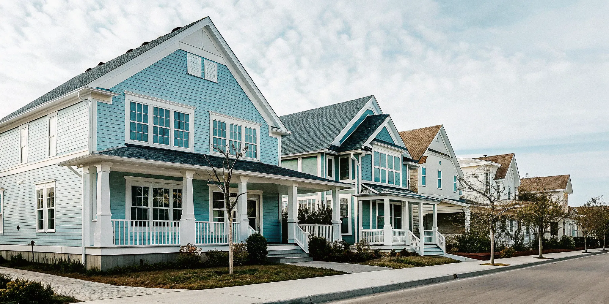
Classic Blues
Blue is one of those colors that just feels right on a home’s exterior. It can be dramatic and moody or light and airy, depending on the shade you choose. Deep navy and blue-gray tones have become incredibly popular for their soothing and inviting qualities. When you pair a deep blue with crisp white trim, you get a look that’s both modern and timelessly elegant. On the other hand, lighter blues can give your home a cheerful, coastal feel, especially when accented with warm wood details. No matter the shade, blue offers a classic look that feels both grounded and stylish.
Earthy Tones for a Natural, Calming Vibe
For a home that feels connected to its surroundings, earthy tones are an excellent choice. Muted greens, especially soft sage, are incredibly popular right now. These colors blend beautifully with natural landscapes, creating a serene and inviting feel. Earthy tones are warm and sophisticated, making your home feel grounded and peaceful. They work especially well on homes with stone or wood elements, enhancing the natural materials. These nature-inspired hues provide a subtle touch of color that feels both current and timeless, perfect for creating a welcoming retreat.
Trending Greens
Within the earthy palette, shades of green are having a major moment. We’re not talking about bright lime, but rather the soft, muted greens that feel pulled directly from nature. Earthy sage, in particular, has become a favorite because it’s calm and connects your home to the surrounding landscape, creating a seamless transition between your house and your yard. This color works beautifully on a variety of home styles and pairs well with crisp white trim or natural stone accents for a look that feels both fresh and grounded. Choosing one of these trending greens is a wonderful way to give your home a peaceful, sophisticated vibe that feels deeply connected to nature.
Can’t-Miss Exterior Color Combinations
A successful exterior paint job is about more than just the main color; it’s about creating a cohesive palette. Most homes look best with a scheme of three to four colors for the body, trim, and accents like shutters or the front door. When selecting your colors, think about how they’ll work with the fixed elements of your home, such as your roof color and any brick or stonework. The way natural light hits your house at different times of day will also change how the colors appear. You can browse our project gallery to see how different combinations come to life.
Emerging Color Trends
While classic colors provide a reliable foundation, it’s also fun to see what’s new on the horizon. Emerging color trends offer fresh ways to express your personality and give your home a current feel. These aren’t fleeting fads but thoughtful shifts toward colors that reflect a desire for warmth, nature, and sophisticated drama. Exploring these newer shades can be the perfect final touch for a major home renovation, ensuring your exterior feels as updated as your interior. From earthy tones that ground your home in its landscape to rich hues that offer a modern alternative to black, these trends provide exciting new possibilities for your curb appeal.
Rich Browns: The New Alternative to Black
For years, black has been the top choice for a bold, dramatic exterior. Now, rich brown shades are gaining popularity as a slightly softer, warmer alternative. Think deep chocolate, espresso, and sable hues that provide the same depth and sophistication as black but with a more inviting feel. According to exterior design experts, these rich brown shades offer warmth and a dramatic look that is both modern and timeless. This color works beautifully with cream or off-white trim for a high-contrast look, or paired with natural stone and wood for a seamless, organic style. It’s a perfect choice if you want to make a statement that feels both strong and welcoming.
Soft Oranges: Warm and Welcoming
If you’re looking to create a home that feels instantly friendly, consider the growing trend of soft, chalky orange colors. These aren’t bright, loud oranges, but rather muted shades like terracotta, apricot, and pale rust that bring warmth and charm to an exterior. These hues are perfect for adding a touch of personality without overwhelming the architecture. They evoke a sense of sun-baked earthiness that is both cheerful and sophisticated. Soft oranges pair wonderfully with creamy whites, deep greens, and natural wood accents, creating a palette that feels both unique and grounded. It’s a fantastic way to make your home stand out in the neighborhood for all the right reasons.
Earthy Sage Greens: Connecting with Nature
Bringing a sense of the outdoors to our homes continues to be a major design influence, and that extends to the exterior. Earthy sage green is a calm, natural color that connects your home to its surroundings, making it feel like a peaceful retreat. This muted, gray-green hue is incredibly versatile, complementing everything from traditional brick to modern siding. It’s a color that feels serene and grounding, changing subtly with the light throughout the day. Paired with crisp white trim and a dark-colored front door, sage green creates a look that is classic, refreshing, and effortlessly elegant, blending beautifully with the natural landscape of the Chicagoland area.
Sophisticated Darks: Moody Blues and Grays
The trend toward dark exteriors is evolving beyond basic black and into more nuanced, sophisticated shades. Moody blues and deep grays are making a significant impact, offering a bold yet elegant statement. A rich charcoal gray, for example, is a bold, elegant color that makes a statement and works well with modern designs, adding depth and character. Likewise, a deep navy or slate blue can feel both classic and contemporary, especially when accented with bright white trim or warm wood details. These sophisticated darks create a powerful backdrop that makes landscaping pop and gives a home a distinct, custom-designed feel. They are perfect for homeowners who want a memorable look that is full of confidence and style.
Matching Paint Colors to Your Home’s Style
Your home’s architecture is one of the best guides for choosing an exterior color palette. The right colors will highlight its best features and create a cohesive look that feels intentional and beautiful. Instead of picking a color you love and hoping it works, start by considering your home’s style. Whether you live in a sleek modern build or a classic colonial, there’s a color scheme that will feel just right.
Choosing Colors for a Modern Home
Modern homes are defined by clean lines and simple forms, so your color choices should be just as sharp. Steel-toned blues and grays offer a sophisticated, clean look, while a crisp white can make architectural details pop. For a more dramatic effect, deep charcoal or black can be incredibly striking, providing a perfect backdrop for features like large windows and metal accents. If you want a touch of personality, a single, bold accent color on the front door adds a playful yet polished touch. You can see how these palettes come to life in our project gallery.
Perfect Palettes for Traditional Homes
Traditional and Colonial homes have a timeless charm that calls for a classic color palette. These styles look best with muted earth tones that feel warm and inviting, like soft beiges, gentle grays, and classic creams. For the main body, colors like taupe or a muted green honor the home’s historical roots while still feeling fresh. Shutters and doors are great places to introduce deeper, richer colors like a stately navy blue or a historic brick red. The goal is to create an elegant look that enhances the home’s classic appeal, a common focus in many home renovations.
Cozy Colors for Farmhouse & Rustic Styles
The modern farmhouse style is all about creating a cozy, comfortable, and unpretentious vibe. The color palette should reflect that simplicity and connection to nature. Classic neutrals are always a winning choice—you can’t go wrong with a warm, creamy white for the body of the house, often paired with black trim for a crisp contrast. If you want more color, consider rich earth tones or soft pastels like a pale blue. These colors work beautifully with natural materials like wood and stone. Our design and build services can help you create this cohesive, rustic look from the ground up.
Historic Hues for Craftsman & Bungalow Homes
Craftsman and bungalow homes are known for their detailed woodwork and deep connection to the natural world. The best exterior color palettes for these homes draw inspiration directly from the landscape. Think rich, earthy tones like olive greens, deep browns, and rusty reds that help the house feel grounded. Craftsman homes often feature several complementary colors to highlight different architectural elements, such as the trim, gables, and porch columns. This layered approach celebrates the home’s intricate craftsmanship and is a great way to add character, especially when planning seamless home additions.
How to Choose the Right Type of Exterior Paint
Picking the perfect color is exciting, but the type of paint you choose is what truly protects your home and keeps it looking fresh for years. The right paint formula depends on your home’s exterior material, our wild Chicagoland weather, and the final look you want to achieve. Understanding the basics of paint types and finishes will help you make a choice that not only looks beautiful but also stands up to the elements.
Latex vs. Oil-Based: Which Is Better for Exteriors?
The biggest decision you’ll make is between latex and oil-based paint. Latex, or water-based, paint is the most popular choice for home exteriors today. It’s flexible, which means it can expand and contract with temperature changes without cracking. Latex paint is also more eco-friendly, dries faster, and cleans up easily with soap and water. Plus, it doesn’t yellow over time with sun exposure, keeping your colors true.
Oil-based paint, on the other hand, is known for its incredible durability and smooth, hard finish. It levels out beautifully, minimizing brush strokes, and creates a tough shell that resists scuffs and stains. This makes it a great option for high-traffic surfaces like front doors, railings, and trim. However, it takes longer to dry, requires mineral spirits for cleanup, and can become brittle and crack over time.
Picking Paint That Can Handle Your Climate
Here in Chicagoland, we get the full spectrum of weather—hot, humid summers and freezing, snowy winters. These extreme temperature swings cause your home’s siding to expand and contract throughout the year. This is where paint choice becomes critical. Latex paint is generally the best performer in fluctuating conditions because its flexible nature moves with your home, preventing peeling and cracking.
While oil-based paint is tough, its rigid finish can struggle with the constant movement of siding in a variable climate, making it more susceptible to cracking. For most siding applications in our area, a high-quality acrylic latex paint is the most reliable choice for long-lasting protection and beauty.
How to Prep Wood, Stucco, and Siding for Paint
The material of your home’s exterior plays a huge role in what paint you should use. Modern materials like fiber cement, vinyl, and stucco do best with a high-quality acrylic latex paint. It adheres well to these surfaces and provides the flexibility they need. For wood siding, you have more options, as both latex and oil-based paints can work well, but proper prep is non-negotiable to prevent wood tannins from bleeding through.
No matter the paint, success starts with preparation. Every professional exterior paint job begins with a thoroughly cleaned, scraped, and sanded surface. Any necessary repairs are made, and a high-quality primer is applied to ensure the paint adheres properly and lasts as long as possible. This foundational work is a key part of any successful home renovation.
Matte, Satin, or Gloss? How to Pick the Perfect Finish
The paint’s finish, or sheen, affects its durability, cleanability, and overall appearance. A matte or flat finish has no shine, which is excellent for hiding minor imperfections on siding. However, it can be more susceptible to dirt and mildew. A satin or eggshell finish is the most popular choice for exteriors because it offers the best of both worlds: a low-lustre look with better durability and easier cleaning than a flat finish.
For trim, shutters, and doors, a semi-gloss or gloss finish is ideal. The higher sheen provides a tough, durable coating that’s simple to wipe clean. It also creates a subtle contrast that makes architectural details pop. Combining different finishes can add dimension and visual interest to your home’s exterior, which you can see in our project gallery.
Low Lustre and Satin for Siding and Trim
For the main body of your house, a satin or eggshell finish is almost always the right call. Think of it as the perfect middle ground—it has a soft, low lustre that isn’t distractingly shiny but is far more durable and easier to clean than a completely flat finish. This slight sheen helps the paint resist dirt and mildew, and when it does get dirty, you can gently wash it without damaging the surface. A flat finish might hide imperfections well, but it tends to hold onto grime. A satin finish gives you that clean, elegant look while providing the resilience your home’s exterior needs to withstand the elements, making it the most popular and practical choice for siding.
Semi-Gloss and High-Gloss for Doors and Accents
When it comes to the details that make your home stand out, like the front door, shutters, and window trim, a higher sheen is your best friend. A semi-gloss or high-gloss finish creates a beautiful contrast against the lower lustre of your siding, making these architectural features pop. Beyond the aesthetics, these finishes are incredibly tough and durable. High-touch areas like your front door and railings need a surface that can handle frequent use and is easy to wipe clean. The smooth, hard film of a glossier paint provides exactly that, ensuring these key accents not only draw the eye but also hold up beautifully over time.
Considering Special Surfaces and Materials
The material your home is made of is a huge factor in choosing the right paint. A formula that works wonders on wood siding might fail completely on vinyl or stucco. Each surface has unique properties—some are porous, some are smooth, and some expand and contract more with temperature changes. Using a paint designed specifically for your home’s material ensures proper adhesion and flexibility, which is the key to a finish that won’t crack, peel, or fade prematurely. Before you fall in love with a color, it’s important to understand what type of product will give you the most beautiful and long-lasting results.
Paints Designed for Vinyl Siding
If you have vinyl siding, you don’t have to replace it to change your home’s color. You can absolutely paint it, but you need to use the right product. Vinyl expands and contracts significantly with temperature shifts, so you need a paint that is flexible enough to move with it. Look for acrylic latex paints labeled “vinyl-safe.” These formulas are designed to adhere to the slick surface and often come in colors that won’t absorb too much heat, preventing the siding from warping. Brands like Benjamin Moore and Sherwin-Williams offer specific lines formulated for this purpose, giving you a durable finish that can completely refresh your home’s look.
When to Use Exterior Wood Stains
For certain parts of your home, like a deck, fence, or natural wood siding, a stain can be a better choice than paint. While paint forms a protective layer on top of the wood, a stain soaks into the wood fibers to protect them from within. This is especially important for horizontal surfaces like decks that take a beating from foot traffic and weather. A stain allows the natural beauty and grain of the wood to show through, creating a rustic, organic look. Stains are also less likely to peel or chip the way paint can, making future maintenance much simpler—you can often just clean the surface and apply a fresh coat.
How to Pair Exterior Paint Colors Like a Pro
Choosing a color palette for your home’s exterior can feel like a huge decision, but it’s also one of the most exciting parts of a renovation. The right combination of colors will not only reflect your personal style but also highlight your home’s best architectural features. Think of it as dressing your home to impress. A well-thought-out color scheme creates a cohesive and inviting look that you’ll love coming home to every day. The key is to build a palette layer by layer, starting with your main color and adding complementary shades for trim and accents. This process allows you to create depth and character, turning your house into a home that truly feels like your own. When done right, the colors work together to tell a story and create a lasting first impression.
Pairing Your Main Color with the Perfect Trim
The foundation of any great exterior color scheme is the relationship between the body and trim colors. The body color is the main shade that covers most of your home’s siding, while the trim color is used for details like window frames, fascia, and door casings. A good rule of thumb is to use a palette of three to four colors total for a polished look. You can create a classic, high-contrast look with a light body color and dark trim, or go for a more subtle, modern feel with a darker body and lighter trim. The goal is to create harmony and definition, making your home’s architectural details stand out. You can see some beautiful examples of this in our project gallery.
Where to Use Accent Colors for a Pop of Personality
Accent colors are where you can really let your personality shine through. This is the pop of color you might use on your front door, shutters, or even window boxes. If your home’s body and trim colors are fairly neutral, a bold accent color can create a stunning focal point and a warm welcome for guests. Think of a classic white house with black trim—a vibrant red or deep navy blue front door adds instant character. Don’t be afraid to experiment with a few sample pots to find a shade you love. This is your chance to make a statement, and it’s an easy element to change down the road if you ever want a quick refresh.
Coordinating Shutters and Front Doors
When it comes to shutters and your front door, you have a few great options for creating a cohesive look. The most classic approach is to paint them the same color. This creates a sense of unity and balance, especially if you’re using a strong accent color like a deep navy or a timeless black. This strategy works beautifully to frame your home’s facade. Alternatively, you can use two different but complementary colors to add more dimension. For example, you could pair soft gray shutters with a cheerful yellow front door. The key is to ensure both colors work well with your main body and trim colors, creating a palette that feels intentional and welcoming. You can see how these different approaches play out in our project gallery.
Don’t Forget Your Garage Door
The garage door often takes up a significant amount of visual real estate, but it’s frequently an afterthought in the painting process. Painting your garage door is an easy way to make a big difference in your home’s appearance. The most common and often best strategy is to paint the garage door the same color as your home’s main body. This helps it blend in, allowing your front door or other architectural features to be the focal point. Painting it the trim color can also work, but it will draw more attention to the garage. Unless your garage doors are a stunning architectural feature you want to highlight, helping them recede visually usually creates a more balanced and high-end look for your overall home renovation.
How to Match Paint to Your Roof and Stonework
Before you fall in love with a specific paint chip, take a good look at the fixed elements of your home that aren’t changing. This includes your roof, any brick or stone accents, pathways, and even your landscaping. These features have their own colors and undertones that your paint palette should complement, not clash with. For example, a roof with brown shingles will pair better with warm, earthy paint colors, while a gray or black roof works well with cooler tones like blues and grays. Considering these existing materials from the start is a core part of our design and build services because it ensures a seamless, professional result.
Proven Color Pairings for Better Curb Appeal
The right color combination does more than just make your house look good—it significantly improves its curb appeal. A thoughtful palette can make your home appear more inviting and well-maintained from the street. The architectural style of your home can also provide great clues for color selection. For instance, traditional Colonial homes often look best in muted, historic colors, while modern homes can handle bolder, more contrasting palettes. Ultimately, choosing colors that feel authentic to both the house and your personal taste will create a timeless look that enhances your entire home renovation and makes you proud of your space.
Pairing Dark Siding with Metallic Accents
Dark, moody siding is having a major moment, and for good reason. Shades like charcoal, deep navy, and even black create a dramatic and elegant look that feels incredibly modern. To keep these bold colors from feeling too heavy, the key is in the details. Pairing dark siding with metallic accents—like brushed brass light fixtures, sleek nickel house numbers, or a bronze door handle—adds a touch of sophisticated warmth and shine. This combination creates a beautiful contrast that highlights your home’s features. For an extra crisp and polished finish, frame the dark siding with bright white trim to make the entire design look sharp and intentional.
Using Color to Influence Perception
Paint is one of the most powerful tools in a designer’s toolkit, and its influence goes far beyond just looking pretty. The colors you choose for your home’s exterior can actually change how people perceive its size, shape, and overall character. Just like a light-colored room feels more open and airy, a home painted in a light, bright color can appear larger and more welcoming from the street. On the other hand, darker shades can give a home a sense of stability and presence, making it feel more grounded and substantial. It’s a bit of a visual trick that architects and designers use all the time.
By thinking strategically about your color choices, you can highlight the architectural details you love and downplay the ones you don’t. A well-placed accent color can draw the eye to a beautiful entryway, while a cohesive, monochromatic scheme can help unify a home with lots of different angles or additions. Understanding how to use color to your advantage is the secret to creating a look that feels balanced, intentional, and perfectly suited to your home’s unique style. It’s an essential part of the planning process in our design and build services.
Making a Small Home Appear Larger
If you want to give a smaller home a grander presence, your color choice can make a huge difference. The most effective strategy is to use light, bright colors that reflect sunlight and create an illusion of space. Timeless neutrals like crisp whites, warm beiges, and soft, versatile grays are perfect for this. They provide a clean, sophisticated look that makes a home feel open and inviting. To enhance the effect, consider a monochromatic palette where the trim is a shade or two lighter than the main body color. This creates a seamless, unified look that helps the eye see the house as one large, cohesive form, making it feel more substantial than it is.
What to Do Before You Make a Final Decision
Picking a paint color feels like a huge commitment, but a little planning can make the decision much easier. Before you settle on a final shade, walk through these key considerations to ensure the color you choose is one you’ll love for years.
The Golden Rule: Test Your Colors in Every Light
A paint chip can look completely different in the store than it does on your house. The color of natural light changes throughout the day, from the cool, bright light of the morning to the warm, golden tones of the late afternoon. This shifting light can dramatically alter how a paint color appears. To get a true sense of a color, paint large sample swatches on different sides of your home. Observe them at various times—morning, noon, and evening—to see how the color behaves in direct sun and shade. This simple step is the best way to avoid surprises and confirm you’ve found the perfect match.
How to Properly Sample Paint Colors
To really understand how a color will look on your home, you have to test it properly—and that means going bigger than a tiny paint chip. The best method is to get sample pots of your top contenders and paint large swatches, at least two feet by two feet, on different sides of your house. This step is so important because the cool, indirect light on the north side will make a color look completely different than the bright, direct sun on the south side. Observe the swatches throughout the day to see how they change in the morning, noon, and evening light. This detailed testing is a key part of our design and build services because it eliminates surprises. It’s the only way to be sure that the perfect greige you picked out won’t turn purple in the evening shade, giving you total confidence in your final decision.
Work With (Not Against) Your Home’s Fixed Features
Unless you’re doing a complete home renovation, your house has fixed elements that aren’t changing, like your roof, brick or stone accents, and window frames. These features have their own colors and undertones that your new paint color needs to complement. For example, a roof with brown shingles will look best with warmer body colors, while a gray slate roof pairs well with cooler tones. If you have earthy brick, a creamy white trim will look more harmonious than a stark, bright white. Take cues from these existing materials to create a cohesive and polished look that feels intentional.
Does Your Color Choice Fit the Neighborhood?
Your home doesn’t exist in a vacuum. Take a look at the houses next door and across the street. While you don’t have to match them, your color choice should feel at home in the neighborhood. It’s also important to consider your home’s architectural style. A historic Colonial home, for instance, often suits a palette of classic, muted colors, while a modern design might handle a bolder, more monochromatic scheme. If you plan to sell in the near future, neutral colors tend to have the broadest appeal. A professional design and build service can help you find a palette that honors your home’s character while fitting its environment.
How to Pick a Color You’ll Love for Years
Exterior paint trends come and go, but your personal style is what makes a house feel like a home. Painting your exterior is a significant investment, so choose a color that genuinely makes you happy, not just one that’s popular right now. Think about the feeling you want to create. Do you want your home to feel warm and welcoming, or cool and serene? Are you drawn to cheerful, bright colors or calm, earthy tones? Don’t be afraid to let your personality shine through. The right color is the one that makes you smile every time you pull into the driveway.
Choosing Colors That Stand Up to the Elements
Your home’s exterior is its first line of defense against the elements, and here in Chicagoland, it faces a lot—from hot, humid summers to freezing winters. The color you choose isn’t just about aesthetics; it plays a big role in how well your paint job holds up over time. The right paint color and formulation can protect your siding, prevent fading, and keep your home looking fresh for years.
Choosing a weather-resistant color is a smart investment that protects the integrity of your home. A durable exterior finish is a key component of any successful home renovation, ensuring the beauty of your project lasts. Think of it as a protective shield that also happens to look fantastic. By considering how different colors react to sun, heat, and moisture, you can make a choice that is both stylish and practical for our unique climate. Let’s break down what to look for.
How Lighter Paint Can Keep Your Home Cooler
Those sunny Chicago summers can really heat things up. If your home gets a lot of direct sunlight, choosing a lighter exterior color can help keep it cooler. Light shades like crisp white, soft gray, beige, and gentle pastels are excellent at reflecting sunlight rather than absorbing it. This simple choice can make a noticeable difference in your home’s internal temperature, potentially even lowering your air conditioning bills during the hottest months. It’s a practical way to improve your home’s energy efficiency while achieving a classic, clean look that never goes out of style.
Which Paint Colors Are Least Likely to Fade?
Sunlight doesn’t just bring heat; its UV rays are the primary cause of paint fading. While darker, more saturated colors can make a stunning statement, they tend to absorb more UV radiation, making them more susceptible to losing their vibrancy over time. However, that doesn’t mean you have to stick to light colors. Many high-quality modern paints, especially in deeper shades, are formulated with special UV-resistant pigments. When you’re shopping for a darker color, be sure to choose a premium paint line known for its durability and color retention to ensure your home’s beautiful finish lasts.
The Best Paint Choices for Humid or Rainy Climates
Humidity is a major factor in our region, and it can be tough on exterior paint. Excess moisture can lead to blistering, peeling, and the growth of mildew and mold, which can damage your siding and look unsightly. To combat this, it’s essential to select a paint specifically designed for high-humidity environments. Look for high-quality acrylic latex paints that contain mildewcide and other additives that inhibit mold growth. Proper surface preparation is also key to preventing moisture damage, ensuring you get the beautiful results you want and a finish that truly protects your home.
Exterior Paint Color Mistakes (and How to Avoid Them)
Choosing an exterior paint color feels like a huge commitment, and it is! The color you pick sets the tone for your entire home and can impact its curb appeal for years. While it’s exciting to imagine a fresh new look, it’s also easy to make a misstep that you’ll have to live with for a long time. The good news is that most painting mistakes are completely avoidable with a little bit of planning.
From falling for a fleeting trend to underestimating the power of natural light, a few common pitfalls can trip up even the most decisive homeowner. You might pick a color from a tiny paint chip, only to find it looks shockingly different when covering your entire house. Or you might choose a color that clashes with your roof or brickwork. Thinking through your choices and knowing what to look out for will help you land on a color palette you’ll love coming home to every day. Let’s walk through some of the most common mistakes so you can sidestep them with confidence.
Forgetting How Natural Light Changes Everything
One of the biggest mistakes homeowners make is choosing a color without seeing how it looks in different lighting conditions. A color that looks like the perfect soft gray inside the store can appear baby blue in the bright morning sun or drab and muddy on a cloudy day. The direction your house faces also plays a huge role. North-facing homes get less direct light, which can cool down colors, while south-facing homes are bathed in warm light most of the day. As one expert notes, the way colors appear can drastically change depending on the light. Always buy sample pots and paint large swatches on different sides of your house. Check on them throughout the day—in the morning, at noon, and in the late afternoon—to get a true feel for the color.
Choosing a Trendy Color You Might Regret
It’s so easy to scroll through social media and fall in love with the latest trendy exterior color. But while that moody, dark charcoal looks stunning on a modern home in a magazine, will it feel right for you and your home’s style? It’s important to choose colors that resonate with your personal style rather than what’s popular right now. Trends come and go, but your home’s exterior is a long-term investment. Before you commit, ask yourself if you’ll still love this color in five or ten years. Your home should be a reflection of you, not a passing fad. Take a look at our project gallery to see timeless color schemes that last.
Underestimating a Professional Opinion
Your home’s exterior is a complex palette. You’re not just choosing one color; you’re creating a scheme that needs to work with your roof, trim, windows, stonework, and even your landscaping. It can be overwhelming to make all these elements work together harmoniously. This is where professional guidance is invaluable. A designer or an experienced contractor can help you see the bigger picture and create a cohesive look. They understand how to balance undertones and select complementary shades for a polished result. Our design and build services include expert color consultations to ensure your home’s new exterior is everything you’ve dreamed of and more.
Why a Design-Build Firm’s Input is Valuable
It’s one thing to pick a color you like, but it’s another to create a full exterior palette that works with everything already in place. Your home has so many fixed features—the color of your roof, the undertones in your brick or stone, and the style of your window frames—that all need to harmonize. Making these elements work together is where the expertise of a design-build firm is invaluable. An experienced team can see the bigger picture, understanding how different materials and colors interact in real-world lighting. They can guide you toward a cohesive scheme that feels both beautiful and intentional, saving you from the stress and potential regret of a costly mistake.
How to Save Money on High-Quality Paint
A fresh coat of paint is one of the most impactful updates you can make to your home’s exterior, but the cost of high-quality paint can add up quickly. The good news is that you don’t have to choose between a beautiful, long-lasting finish and your budget. Saving money on paint isn’t about cutting corners or settling for a lower-grade product; it’s about being strategic with your timing and resources. A little planning can go a long way in reducing the overall cost of your project.
Whether you’re tackling a full home renovation or just refreshing your curb appeal, thinking like a savvy shopper will help you get the best materials for less. From timing your purchases to leveraging professional relationships, there are several practical ways to make your paint budget stretch further. By combining a few of these tips, you can get that premium, durable finish you want without overspending, ensuring your home looks its best for years to come.
Time Your Purchase with Seasonal Sales
Timing is everything when it comes to buying paint. Home improvement stores frequently offer significant discounts during seasonal sales events, especially around holiday weekends like Memorial Day, the Fourth of July, and Labor Day. Planning your purchase around these times can lead to substantial savings. You can also find great deals during the off-peak seasons for painting, such as late fall or early spring. When demand is lower, retailers are often more motivated to offer discounts to attract customers. Keep an eye on weekly flyers and online ads to catch these promotions.
Take Advantage of Loyalty Programs
If you shop at a particular home improvement or paint store often, signing up for their loyalty program is a no-brainer. These programs are almost always free to join and can provide a steady stream of savings. Members often receive exclusive coupons, early access to sales, and points on every purchase that can be redeemed for future discounts. It’s a simple, low-effort way to save money on not just paint but all the other supplies you’ll need for your project, like brushes, rollers, and tape. A quick sign-up online or at the register can unlock savings you would have otherwise missed.
Don’t Be Afraid to Ask for a Contractor Discount
One of the best ways to save on materials is by working with a professional contractor. Companies like ours have long-standing relationships with paint suppliers and receive trade discounts that aren’t available to the general public. These savings on high-quality paint can be significant, especially on a large project like a full exterior repaint. Furthermore, scheduling your project during a contractor’s slower season can sometimes lead to more competitive pricing. When you contact us about your project, we can manage the material procurement to ensure you get the best paint at the best price.
Related Articles
Request A Free Estimate
Frequently Asked Questions
How long should a quality exterior paint job last? A professionally applied, high-quality exterior paint job should last anywhere from 5 to 10 years. The exact lifespan depends heavily on a few key factors: the quality of the paint used, the condition of your siding, and how thoroughly the surface was prepared before the first brushstroke. Proper prep work—cleaning, scraping, and priming—is what ensures the paint adheres correctly and can withstand Chicago’s weather, giving you a beautiful finish that truly endures.
What’s the best time of year to paint a house in the Chicago area? For the best results, we need a string of mild, dry days, which makes late spring and early fall the ideal seasons for exterior painting in Chicagoland. Paint needs time to cure properly, and it struggles to do that in extreme temperatures. The intense heat and humidity of mid-summer can cause the paint to dry too quickly, while the cold, damp conditions of late fall and winter can prevent it from adhering correctly.
Is more expensive paint really worth the cost? Yes, in almost every case. Premium paint brands invest in higher-quality ingredients, like better pigments for richer, fade-resistant color and superior binders that create a more durable and flexible finish. While you might save a little upfront with a budget option, a higher-quality paint will give you better coverage, last longer, and protect your home more effectively, saving you the cost and hassle of repainting sooner.
I’m overwhelmed by choices. How do I pick a front door color that works? Think of your front door as the perfect place to show some personality. A great way to start is by looking at the other colors on your home. A classic black or deep charcoal door looks sharp and sophisticated with almost any color palette. If you want a pop of color, pull a subtle shade from your home’s brick or stonework and use a bolder version of it on the door. And remember, it’s just a door—it’s one of the easiest and most affordable things to repaint if you ever want a change.
Do I really need to paint samples on my house before deciding? Absolutely. This is probably the single most important step in the entire process. A small paint chip can’t show you how a color will look when it’s covering a large wall and interacting with natural light. Painting large sample swatches on different sides of your house lets you see how the color changes from the bright morning sun to the warm afternoon glow. It’s the only way to be sure you’ll love the color at all times of the day.
Can I paint brick in the Chicago suburbs, or should I leave it natural?
You can paint brick, but it’s a bigger commitment than siding because brick needs to breathe and proper prep matters. If your brick is in good shape, many homeowners update the look by painting trim + doors first before painting the masonry.
How do I choose a color if my house gets a lot of shade from trees?
North-facing walls and heavy shade can make colors look cooler/darker. Test boards on multiple sides of the home and check them morning vs. afternoon—this is especially important in neighborhoods with mature trees.
What’s the best way to estimate my exterior painting budget before I call?
Use a cost breakdown first (size, stories, siding type, prep needs), then request a quote. This helps you spot “too-good-to-be-true” pricing. https://thpbuilders.com/cost-to-paint-house-exterior/
Do you help homeowners choose colors locally?
Yes—color decisions are easier when guided by your home’s fixed features (roof/brick/stone) and neighborhood context. If you’re nearby (THP Builders is based in Wilmette), you can also request a consultation.