
Standing in front of a wall of paint swatches can feel completely overwhelming. How can you possibly choose the right color from a tiny two-inch square? The fear of picking the wrong shade—one that’s too bright, too dull, or just clashes with your brick—is real, and it can lead to total decision paralysis. But choosing an exterior paint color doesn’t have to be so stressful. We’ll give you a clear, step-by-step framework for narrowing your options, testing colors correctly, and making a final decision with confidence, ensuring you get a result you’ll absolutely love.
Key Takeaways
- Look beyond trends to find your perfect color: The most beautiful exterior paint is one that complements your home’s permanent features, like its architectural style, roof color, and stone accents, creating a cohesive and timeless look.
- A lasting finish depends on quality materials and proper prep: Don’t cut corners on surface preparation. Thoroughly cleaning, sanding, and priming is just as important as using a durable, high-quality paint for a result that withstands the elements.
- Test your top colors in the real world before you commit: Paint large sample swatches on your siding and observe them at different times of day to see how the color truly looks in natural light before making a final decision.
What Makes an Exterior Paint Color Truly Beautiful?
Choosing an exterior paint color feels like a huge decision, and it is! The right shade can completely transform your home’s curb appeal. But what makes a color truly beautiful isn’t just about the trend of the moment. It’s about finding a color that feels like a natural extension of your home’s character, works with its existing features, and is applied with quality and care. A beautiful exterior is a thoughtful combination of color, quality, and style that comes together to create a welcoming first impression.
Find a Color That Fits Your Home’s Style
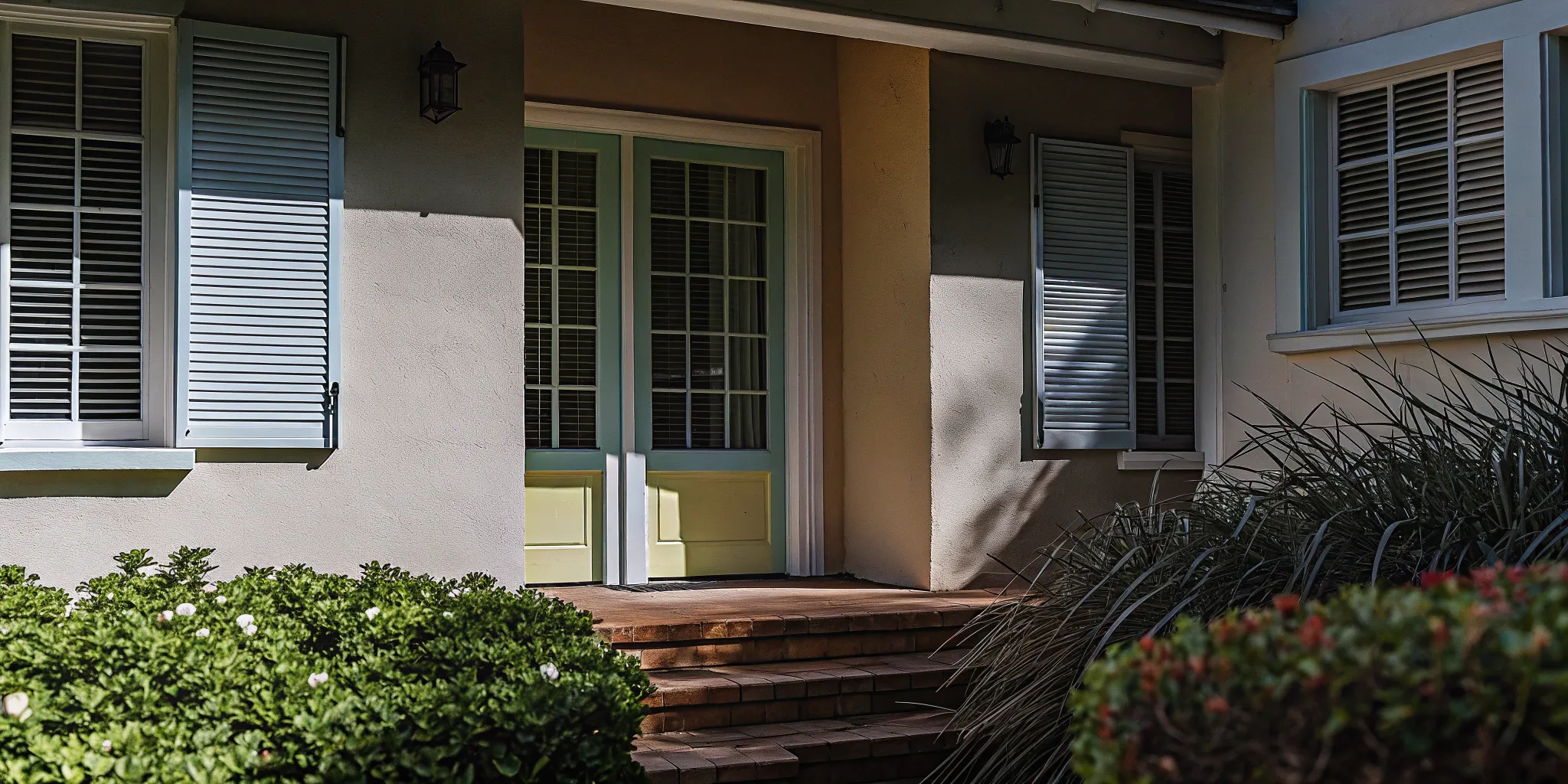
The most beautiful color for your house is one that complements its architectural style. A classic color palette might feel right at home on a traditional Colonial, while a modern farmhouse can handle a bolder, more contemporary shade. When you’re choosing a color, think about the elements you can’t change, like your roof, brick or stone accents, and window trim. The goal is to create a cohesive look where the paint color ties everything together. A successful color scheme considers the entire picture, which is a key part of any thoughtful home renovation.
Why Paint Quality and Finish Are So Important
A gorgeous color can fall flat if the paint quality is poor. High-quality paint not only looks better but also provides a durable shield for your home, protecting it from Chicago’s weather. The finish you choose—like satin, eggshell, or semi-gloss—also plays a big role in the final look. A satin finish offers a slight sheen that’s easy to clean, while a contrasting semi-gloss on the trim can make your main color pop. These details are essential in creating a polished, professional result, and it’s why our design and build services always focus on selecting the right materials for the job.
Our Go-To Exterior Paint Brands
When it comes to exterior paint, quality is everything. A great paint job not only looks beautiful but also acts as your home’s first line of defense against the elements. After years of completing home renovations across Chicagoland, we’ve learned which brands consistently deliver a durable, vibrant finish that stands the test of time. These are the paints we trust to protect our clients’ homes and keep them looking their best for years to come.
Benjamin Moore Aura Exterior
Benjamin Moore’s Aura Exterior Paint is a true standout for its remarkable durability and color retention. What we love about it is that it’s self-priming on most surfaces, from wood to masonry, which makes the whole process more efficient. It also dries quickly, helping to create a smooth, flawless finish without those annoying lap marks. You get excellent coverage with fewer coats, which is a huge plus for both light and dark colors. It’s a premium choice that delivers a rich, long-lasting look that resists fading and harsh weather, making it perfect for Chicago homes.
Sherwin-Williams Duration
If you’re looking for a paint that can handle whatever Chicago weather throws at it, Sherwin-Williams Duration is a fantastic option. This premium exterior paint is formulated for excellent adhesion and incredible durability. We recommend it because it creates a long-lasting finish that truly holds up over time. Its unique formula is specifically designed to resist fading and mildew, which is essential for maintaining your home’s curb appeal. When you want a beautiful appearance that you can count on to last, Duration Exterior Acrylic Latex is one of our most trusted choices for a reliable, protective coating.
Behr Premium Ultra
Behr is a household name for a reason, and their Premium Ultra exterior paint combines advanced paint technology with seriously impressive performance. It offers fantastic coverage and is highly resistant to fading, mildew, and stains, keeping your home looking fresh and clean. One of the biggest conveniences is that it’s a paint-and-primer in one for most surfaces, which can save a lot of time and effort during application. For homeowners who want a high-quality finish without extra steps, Behr Premium Ultra is a reliable and effective choice for a beautiful exterior refresh.
PPG Timeless
PPG Timeless is another one of our top picks, especially for its superior durability and fade resistance. This paint is engineered to provide a tough, long-lasting finish that can withstand the elements year after year. We appreciate that it helps maintain the vibrancy of your chosen color, protecting it from the sun’s harsh rays. The Timeless exterior paint also features a self-priming formula, which simplifies the painting process and helps ensure a smooth, even application. It’s an excellent product for achieving a professional-grade finish that will protect your home and look great for years to come.
Exterior Paint Colors That Instantly Add Curb Appeal
Choosing an exterior paint color feels like a huge commitment, but it’s also one of the most transformative updates you can make to your home. The right palette can completely refresh your home’s appearance, highlight its best architectural features, and create a welcoming first impression. While personal taste is always the most important factor, looking at current trends can provide some great inspiration. The goal is to find a color that not only looks beautiful today but will also be something you love coming home to for years.
Whether you’re drawn to soft, earthy tones or a more dramatic, modern look, there’s a color scheme that will fit your home’s style perfectly. We’ve seen so many stunning transformations, and it often comes down to a thoughtful combination of colors for the siding, trim, and front door. You can see some of our favorite home renovations in our gallery to get a feel for how different palettes work on real Chicagoland homes. Let’s explore some of the most popular color families that consistently deliver incredible curb appeal.
Create a Welcoming Vibe with Warm Neutrals
You can never go wrong with warm neutrals and earthy shades. Colors like beige, taupe, warm grays, and creamy off-whites are incredibly popular because they create a clean, sophisticated, and inviting look. These colors act as a perfect backdrop, allowing your landscaping, stonework, or other architectural details to stand out. They feel grounded and timeless, avoiding the risk of looking dated in a few years. A neutral palette is also wonderfully versatile, pairing well with almost any accent color for your front door or shutters. For inspiration, check out Benjamin Moore’s collection of warm neutral paints.
Popular Beiges and Taupes
If you’re leaning toward a warm neutral, you have some incredible options that feel both modern and timeless. These colors are favorites for a reason—they provide a sophisticated warmth that complements natural materials like stone and brick beautifully. For a versatile color that works almost anywhere, consider Sherwin-Williams’ Accessible Beige. It’s a soft, warm neutral that avoids looking too yellow or too gray. Another fantastic choice is Benjamin Moore’s Manchester Tan, which offers a slightly richer warmth that feels incredibly inviting. These shades are perfect for creating an exterior that feels grounded, elegant, and welcoming.
Make a Statement with Bold Accents
For those wanting to make more of a statement, dark and moody exteriors are having a major moment. Deep charcoal grays, rich navy blues, and even black can give a home a modern and dramatic flair. The key to pulling off a dark color is creating contrast. Pairing a dark siding with crisp white or light-colored trim creates sharp, clean lines that define the home’s architecture and prevent the color from feeling too heavy. A brightly colored front door can also add a playful pop of personality. This approach is all about creating a balanced, high-impact look that feels both contemporary and timeless.
Classic Navy and Deep Greens
If you love a classic look but want something with more personality than a neutral, navy blue is a fantastic choice. It’s incredibly versatile, feeling just as right on a historic home as it does on a new build. According to Curbio, “Navy blue is a popular, deep blue that looks classic with white trim and can be used anywhere.” For a color that feels connected to the landscape, consider a deep forest or hunter green. These shades are sophisticated and grounding. A dark green looks elegant and connects to nature, creating a rich, organic feel that works beautifully with lush gardens and mature trees, making your home feel settled and serene.
Dramatic Charcoals and Off-Blacks
For a truly modern and sophisticated exterior, you can’t beat the impact of charcoal or off-black. These colors are confident and stylish, turning a simple facade into a statement. As noted by Veranda, a Dark Gray makes a bold statement, especially when paired with crisp white or natural wood trim to highlight your home’s architectural lines. Going even darker with a gray-black adds a layer of elegance and drama that really stands out in any neighborhood. This choice is perfect for homeowners who want a contemporary look that still feels timeless and chic, creating a powerful first impression that is both memorable and refined.
Can’t Go Wrong with These Classic Shades
Classic colors are considered classics for a reason—they always look good. Hues like classic white, light gray, and soft beige offer a “blank slate” that is easy to personalize with shutters, doors, and landscaping. These shades are particularly effective for a wide range of architectural styles, from historic colonials to modern farmhouses found throughout the Chicagoland area. Choosing a timeless color is also a smart move for long-term value, as it appeals to a broad audience. Our design and build services can help you select a classic palette that perfectly complements your home’s unique character and style.
Timeless Whites and Off-Whites
There’s a reason why white and off-white homes never go out of style. These shades create a crisp, clean, and sophisticated look that feels both fresh and timeless. Creamy off-whites and soft beiges offer a welcoming warmth, while a classic, bright white provides a stunning contrast against green landscaping and blue skies. This neutral palette is incredibly versatile, serving as a perfect “blank slate” that allows you to personalize your home with colorful shutters, a bold front door, or unique architectural details. It’s a choice that complements nearly any style, from a historic bungalow to a modern new build, ensuring your home looks elegant for years to come.
Versatile Grays
Gray has become a modern neutral that offers incredible depth and versatility for home exteriors. The options range from soft, light grays that feel airy and bright to deep, dramatic charcoals that create a bold, contemporary statement. Warm grays with beige undertones can make a home feel cozy and inviting, while cool grays with blue undertones offer a sleek, sophisticated vibe. Gray is also fantastic for complementing existing materials like brick or stone, tying the whole look together. Choosing the right shade can highlight your home’s best features and create a polished look that enhances your entire home renovation project.
Current Exterior Color Trends
While timeless colors are always a safe bet, it’s fun to see what’s currently catching everyone’s eye. Trends can offer fresh inspiration and help you see your home in a new light. Right now, we’re seeing a big move in two distinct directions: one toward soft, earthy warmth and the other toward bold, dramatic depth. Both looks are stunning in their own way and can be adapted to fit a variety of home styles, from classic bungalows to modern new builds. The key is to find a trend that resonates with you and complements your home’s unique architecture.
The Shift Toward Warmer Neutrals
For years, cool grays dominated exterior color palettes, but the trend is now shifting toward warmer, more inviting neutrals. Think creamy whites, soft taupes, and warm beiges that create a sophisticated and welcoming feel. These colors are incredibly versatile and pair beautifully with natural materials like stone, brick, and wood, which are common in many Chicagoland homes. According to experts, these warm neutrals are favored because they feel both timeless and modern, providing a perfect backdrop that enhances your home’s architecture without overwhelming it.
The Growing Popularity of Dark Exteriors
On the other end of the spectrum, dark and moody exteriors are gaining serious traction. Deep charcoals, rich navy blues, and even off-blacks are being used to create a sense of drama and modern elegance. Once reserved for accents, these darker colors are now covering entire homes, making a bold and confident statement. When paired with crisp white trim or warm wood details, a dark exterior can look incredibly sharp and sophisticated. This trend is perfect for homeowners looking to give their property a distinctive, high-end appearance as part of a larger home renovation.
Choosing Colors to Increase Your Home’s Value
Painting your home’s exterior is one of the most impactful ways to improve its curb appeal, and it can also have a significant effect on its resale value. While you should always choose a color you love, if you’re thinking about selling in the next few years, it’s wise to consider what will appeal to the broadest range of potential buyers. The right color choice can make your home feel well-maintained and inviting, helping it stand out in the market for all the right reasons. It’s a strategic update that offers a fantastic return on investment.
Why Neutral Palettes Attract More Buyers
When it comes to resale, neutral and traditional colors are almost always the winning choice. Shades of gray, beige, and off-white create a clean canvas that allows potential buyers to easily envision themselves living in the home. A bold or highly specific color can be polarizing and might deter someone who can’t look past it. Neutrals, on the other hand, feel safe, classic, and move-in ready. They appeal to the widest audience, which is exactly what you want when your home is on the market. This simple strategy helps make a great first impression before buyers even step inside.
Top Exterior Colors for Resale
If you’re aiming for maximum appeal, you can’t go wrong with a tried-and-true neutral. Paint brands often highlight their most popular shades, which are a great starting point for your search. For example, some of Benjamin Moore’s most popular exterior colors include Revere Pewter, a classic warm gray, and Coventry Gray, a slightly cooler, more traditional shade. These types of colors are consistently favored because they look great on a wide variety of home styles. Selecting a proven color is a smart way to ensure your investment pays off when it’s time to sell.
Latex vs. Oil-Based Paint: Which One Lasts Longer?
Choosing an exterior paint involves more than just picking a color you love. The type of paint you use—latex or oil-based—plays a huge role in how long your home looks fresh and protected. Each has its own strengths, and the best one for your project depends on your home’s materials, the Chicago climate, and the finish you’re after. Understanding the difference will help you make a choice that protects your investment and keeps your home looking its best for years.
Why We Usually Recommend Latex Paint
Most modern exterior paints are latex-based, and for good reason. These water-based paints are known for their ease of use, quick drying time, and simple soap-and-water cleanup. For homeowners in Chicagoland, one of the biggest advantages is flexibility. Latex paint expands and contracts with temperature changes, which means it’s less likely to crack or peel during our hot summers and freezing winters. This durability gives it an impressive lifespan, often lasting up to 15 years or more before needing a refresh. Its lower level of volatile organic compounds (VOCs) also makes it a more environmentally friendly choice.
When Should You Use Oil-Based Paint?
While latex paint is the go-to for siding, oil-based paint still has an important place. Think of it as the heavy-duty option. Oil-based paints cure to a harder, more durable finish that stands up exceptionally well to scuffs, dings, and daily wear. This makes them an excellent choice for high-traffic surfaces like doors, railings, and window trim. The glossy, smooth finish they provide is also hard to beat. However, they take longer to dry, require mineral spirits for cleanup, and tend to have a shorter lifespan of 5-10 years. The pros and cons make it a strategic choice for specific applications.
Does Your Siding Type Affect Your Paint Choice?
The best paint for your home isn’t just about latex versus oil; it’s about what works best with your siding material. Because latex paint is flexible, it’s the ideal choice for wood and vinyl siding, which naturally expand and contract. For other materials, like certain types of metal or previously painted surfaces, an oil-based primer might be necessary to ensure proper adhesion and a long-lasting finish. Getting this pairing right is a critical step in any home renovation, ensuring your new paint job looks beautiful and protects your home effectively. When in doubt, consulting with a professional can save you from costly mistakes down the road.
How to Choose the Right Exterior Paint Color
Picking the right exterior paint is a big decision. It’s the first thing people see, and it sets the tone for your entire home. But a great paint job is about more than just color—it’s also a protective shield for your house. To get it right, you need to think about your local climate, your home’s unique style, and even your neighborhood’s rules. It sounds like a lot, but breaking it down makes the process much simpler. Let’s walk through the key things to consider so you can choose a paint you’ll love for years to come.
Factor in Your Local Climate
Here in Chicagoland, our homes face everything from humid summers to freezing, windy winters. That’s why your exterior paint needs to be tough. Choosing a high-quality, durable paint is your first line of defense against the elements. Look for formulas specifically designed to handle harsh weather, like wind-driven rain and extreme temperature shifts. Products like Benjamin Moore’s Element Guard® paint are made to resist cracking, peeling, and fading, which means your home will look fresh longer. Investing in the right product now saves you from having to repaint sooner than you’d like.
Work with Your Home’s Architecture
Your home has its own personality, and the paint color should feel like a natural fit. Whether you live in a historic Victorian, a classic bungalow, or a sleek modern build, the architecture should guide your color choices. Ignoring your home’s style is one of the biggest mistakes you can make. Instead, select a palette that highlights its best features. For example, earthy tones often look stunning on Craftsman homes, while a bold, modern color can make a contemporary design pop. Take a look at our project gallery to see how we match paint schemes to different architectural styles across Chicagoland.
Color Palettes for Craftsman Homes
Craftsman-style homes, with their beautiful woodwork and natural materials, look their best when painted in earthy, organic tones. Think deep forest greens, rich browns, and muted reds that echo the colors of nature. These shades create a warm and inviting atmosphere that perfectly complements the home’s architectural features, like its prominent porch and detailed trim. The goal is to enhance the handcrafted feel of the home, not overpower it with a color that feels out of place. A well-chosen earthy palette makes a Craftsman feel grounded and timeless, honoring the style’s emphasis on natural beauty and quality craftsmanship.
Color Palettes for Modern Homes
Modern homes are defined by their clean lines, simple forms, and minimalist aesthetic, which means they can handle bolder, more dramatic color choices. Deep charcoals, crisp blacks, and stark whites create a striking contrast that highlights the home’s geometric shapes. This high-contrast look feels sophisticated and intentional, drawing the eye to the architectural design itself. You can also use a neutral base with a single, vibrant accent color on the front door to add a pop of personality without sacrificing the clean, uncluttered design. It’s all about using color purposefully to enhance the structure’s form.
Color Palettes for Coastal and Spanish Styles
While not as common in the Midwest, homes with coastal or Spanish influences have distinct color palettes that are worth noting. Coastal styles often draw from nature, using soft blues, sandy beiges, and seafoam greens to create a light, airy feel that evokes a sense of tranquility. Spanish-style homes, on the other hand, lean into warm earth tones like terracotta, ochre, and desert sand, often balanced with cool greens and grays to reflect their native landscapes. In both cases, the color palettes are designed to connect the home to its surroundings, creating a look that feels both authentic and serene.
Draw Inspiration From Your Home’s Fixed Elements
One of the best ways to narrow down your paint choices is to look at the parts of your home you can’t change. Your roof, brick or stone accents, window frames, and even your driveway are all “fixed elements” with their own colors and undertones. The most beautiful exterior paint color is one that harmonizes with these features, creating a cohesive and polished look. Instead of seeing them as limitations, think of them as a built-in color palette that can guide your decisions and ensure the final result feels unified. A thoughtful home renovation always considers how new elements will work with the old, and paint is no exception.
Matching Your Roof and Stonework
Your roof and any stonework are major players in your home’s overall color scheme. A black or dark gray roof is wonderfully versatile and works with most colors, while a brown or reddish roof will naturally steer you toward warmer tones like beige, cream, or earthy greens. Look closely at your brick or stone and identify the different colors within it. You might find flecks of gray, cream, or even plum. Pulling one of these subtle undertones for your main paint color is a surefire way to create a harmonious look. You can explore different combinations online to see how colors interact with these fixed features.
Considering Your Landscaping and Surroundings
Your home doesn’t exist in a vacuum, so take a look around for inspiration. Consider your landscaping—a house surrounded by lush greenery might look stunning in a complementary color, while a home with vibrant flower beds may call for a more neutral backdrop to let the flowers shine. Also, take a walk around your neighborhood. While you don’t need to match your neighbors, you do want your home to feel like it belongs. Observing your surroundings is a key part of our design process because it helps ensure your home’s new look fits beautifully within its environment, creating a sense of place and belonging.
Don’t Forget to Check HOA Rules
Before you fall in love with a vibrant color, do a little homework on your neighborhood. Drive around and notice the general color schemes. While you don’t have to match your neighbors exactly, you probably want a color that feels at home in the area. If you have a Homeowners Association (HOA), be sure to check their guidelines, as many have pre-approved color palettes. This step can save you a major headache and the cost of repainting. Also, think about your home’s fixed elements—your roof, brick, or stone accents aren’t changing, so your paint should complement those colors beautifully.
How to Test Paint Colors Before You Commit
Picking a paint color based on a tiny swatch at the store is a recipe for disappointment. The color you see under fluorescent lighting can look completely different on your home’s exterior. To make sure you’ll love the final result, you have to test your top choices in the real world. This crucial step helps you avoid costly mistakes and ensures the color you choose is one you’ll be happy with for years to come.
Explore Different Types of Paint Samples
Once you’ve narrowed your choices down to a few top contenders, it’s time to sample them. There are two great ways to do this: modern peel-and-stick swatches or traditional small paint pots. Peel-and-stick samples offer incredible convenience and a mess-free way to test colors, while paint pots give you a true feel for the paint’s texture and finish directly on your siding. Both methods are effective, and the best choice often comes down to personal preference and how hands-on you want to be with the process.
Using Peel-and-Stick Swatches
Peel-and-stick paint samples have become a game-changer for testing colors without the mess. These large, pre-painted stickers let you see a generous swatch of color without having to pick up a brush. The biggest advantage is their flexibility; you can easily move them around your home’s exterior to see how the color looks in the morning sun, afternoon shade, and under your porch lights. This is a clean, stress-free way to visualize the paint in different lighting conditions. Because they can be reapplied multiple times, you can test a single swatch on your north- and south-facing walls to get a complete picture before you commit.
Testing with Small Paint Pots
While peel-and-stick samples are convenient, there’s still a lot of value in using traditional paint pots. This method allows you to apply the actual paint to your siding, so you can see exactly how it covers your home’s specific texture and what the final finish will look like. For the most accurate test, paint large swatches—at least two feet by two feet—directly on your house. Observe them at different times of day to see how the natural light changes the color. This hands-on approach gives you the truest sense of the final product, which is a critical step in any professional home renovation project.
How to Actually Use Paint Samples
Paint samples are your best friend in this process. Instead of relying on small paper chips, buy sample pots of your top two or three colors. Paint large swatches—at least two-by-two feet—directly on your siding in a few different spots. If you’d rather not paint on your house just yet, you can paint large poster boards and move them around. This allows you to see how the color interacts with your home’s permanent features, like the roof and brickwork. Taking this extra step is a small investment that protects the overall vision of your home renovations.
Check Your Colors in Morning, Noon, and Night
A single paint color can look like several different shades throughout the day. A warm beige might look bright and creamy in the morning sun but take on a deeper, cooler tone in the evening shade. This is why it’s so important to observe your paint samples at various times. Check on them in the morning, at midday, and in the late afternoon on both sunny and cloudy days. This gives you a complete picture of how the color will truly live on your home. You can see great examples of how light impacts color in our project gallery.
Virtually Try On Colors with a Digital Visualizer
If you’re feeling overwhelmed by options, a digital tool can be a great starting point. Most major paint brands offer an online color visualizer that lets you upload a photo of your house and digitally “paint” it with different colors. Using a tool like the Sherwin-Williams ColorSnap Visualizer can help you quickly narrow down your choices and experiment with bold ideas without any commitment. While it’s a fantastic way to get a preview, remember that screen colors aren’t always perfect. You should still use physical samples before making your final decision.
Common Exterior Paint Mistakes (and How to Avoid Them)
Choosing a new exterior paint color is exciting, but a few common missteps can turn your dream project into a costly do-over. The good news is that these mistakes are easy to avoid once you know what to look for. From selecting a shade that clashes with your roof to skipping essential prep work, a little planning goes a long way. Taking the time to get these details right ensures your home will look fantastic and the finish will last for years to come.
Mistake #1: Choosing a Color in a Vacuum
It’s surprisingly easy to choose a color that looks great on a small paint chip but feels completely wrong on your house. One of the biggest mistakes is failing to coordinate the paint with your home’s fixed elements. Your roof, brick or stone accents, and even your window frames have distinct undertones that can clash with the wrong siding color. It’s also important to choose a color palette that honors your home’s architectural style. A color that looks stunning on a modern build might feel out of place on a classic Victorian. Thinking about these elements together will help you land on a color that feels cohesive and intentional.
Mistake #2: Underestimating Surface Prep
You can buy the most expensive, highest-quality paint on the market, but it won’t perform well if you apply it to a dirty or damaged surface. Rushing into painting without proper preparation is a recipe for peeling, cracking, and bubbling down the road. A truly professional finish starts with a clean slate. This means thoroughly washing the exterior to remove dirt and mildew, scraping away any loose or peeling paint, sanding rough spots for a smooth finish, and repairing any damage. This step is tedious but absolutely critical for good paint adhesion and a durable, long-lasting result.
Mistake #3: Using the Wrong Paint for the Job
The paint aisle can be overwhelming, and grabbing the wrong can is a frequent mistake. While paint-and-primer-in-one products are popular, they aren’t a universal solution. A dedicated exterior primer is often essential for creating a uniform surface that helps the topcoat adhere properly and look its best. This is especially true if you’re painting over bare wood, covering stains, or making a dramatic color change. Using the right products for your specific siding material and climate conditions is just as important as the color you choose. When you invest in a full home renovation, getting the paint right is the perfect finishing touch.
Mistake #4: Highlighting the Wrong Features
A great paint job should make your home’s best qualities shine, not draw attention to the things you’d rather hide. A common mistake is choosing a color that clashes with your home’s permanent features, like the undertones in your brick or the color of your roof. For example, a cool gray siding might look jarring next to warm, reddish-brown stonework. The goal is to select a palette that creates a cohesive and timeless look by complementing these unchangeable elements. The right color scheme will highlight beautiful architectural details and make your entire home feel harmonious. This holistic approach is a core part of any successful home design and build project, ensuring every element works together to create a stunning final result.
Pro Tips for a Flawless, Lasting Finish
Choosing the perfect paint color is exciting, but the real magic happens during application. A beautiful color can fall flat if it’s not applied correctly, and nobody wants to see their hard work start to chip and peel after just one season. The difference between a paint job that looks great for a decade and one that fails prematurely often comes down to the details of the process itself. It’s not just about brushing color onto a surface; it’s about creating a durable, protective layer that enhances your home’s beauty and can stand up to Chicago’s demanding weather, from humid summers to freezing winters.
This protective shield is your home’s first line of defense against moisture, UV rays, and temperature swings. When done right, it prevents water from seeping into your siding, which can lead to rot and structural damage. Taking the time to properly prep surfaces, use the right equipment, and paint in the right conditions will pay off in a big way. These steps are what ensure the paint adheres properly, cures to a strong, even finish, and provides maximum protection for your home. Whether you’re planning to tackle this project yourself or are working with a professional team, understanding these fundamentals is key to achieving a result you’ll love for years to come. You can see examples of these stunning, lasting finishes in our project gallery.
Build a Cohesive 3-to-4 Color Palette
A simple way to create a polished, intentional look for your home’s exterior is to build a palette of three to four colors. This usually includes a main color for the siding, a secondary color for the trim, and an accent shade for the front door or shutters. This framework keeps your choices focused and ensures every element works together harmoniously. The key is to select colors that complement your home’s permanent features, like the color of your roof or any brick and stonework. A well-chosen palette should feel like a natural extension of your home’s architectural style, which is a core principle of any successful design and build project. By thinking in terms of a complete palette, you create a cohesive look that feels both beautiful and timeless.
Why Surface Prep is Non-Negotiable
Think of it this way: you wouldn’t build a house on a shaky foundation. The same principle applies to painting. One of the biggest mistakes you can make is rushing to paint without preparing the surface first. A clean, smooth, and stable surface is essential for the paint to stick properly and last. Without it, you’re setting yourself up for cracking, bubbling, and peeling down the road.
Proper preparation involves more than a quick rinse. It means thoroughly cleaning the exterior to remove dirt and mildew, scraping away any loose or peeling paint, sanding rough areas for a smooth texture, and repairing any damage. This step is the most labor-intensive part of the job, but it’s absolutely critical for a professional-quality finish that protects your home.
The Right Tools for a Professional-Looking Finish
Using the right tools can make a world of difference in the quality of your paint job. While it might be tempting to grab the cheapest brush set, investing in high-quality equipment will save you time and frustration. Good brushes and rollers designed specifically for exterior use hold more paint and apply it more evenly, helping you achieve a smooth, consistent finish without unsightly streaks or drips.
For siding, a quality roller with the correct nap length will cover large areas efficiently. For trim, windows, and detailed areas, a good angled brush gives you the control you need for crisp, clean lines. When you see the flawless results in our home renovations, you’re seeing the work of skilled hands using the best tools for the job.
Why the Weather Forecast Is Your Best Friend
Timing is everything, especially when painting your home’s exterior. It’s crucial to choose the right weather conditions for the job. Painting on a day that’s too hot, too cold, too humid, or too windy can seriously compromise the paint’s adhesion and drying process. Extreme temperatures can cause the paint to dry too quickly or too slowly, leading to a weak finish that won’t last.
Ideally, you want a string of clear, dry days with low humidity and temperatures between 50 and 85 degrees Fahrenheit. Avoid painting in direct, intense sunlight, as it can heat the surface and cause the paint to bubble. Planning around Chicago’s unpredictable weather can be tricky, but patience is key to ensuring your hard work results in a durable, beautiful finish.
Where to Buy Quality Exterior Paint
Once you have a few colors in mind, the next step is figuring out where to buy your paint. The right retailer can make a huge difference, offering expert advice and a better selection to ensure your project turns out beautifully. Your choice often comes down to a balance of convenience, cost, and the level of guidance you need. From big-box stores to specialty shops, each has its own advantages for your home renovation project.
Your Local Home Improvement Store
Big-box stores like Home Depot and Lowe’s are a popular choice for a reason. They offer a massive selection of exterior paints from many different brands, making it easy to compare your options and prices all in one trip. This is the perfect place to go if you’re also picking up brushes, rollers, and other supplies. While the convenience is a major plus, the staff may not be paint specialists, so getting detailed, project-specific advice can sometimes be a challenge. If you’ve already done your research and know exactly what you need, these retailers are a solid, budget-friendly option.
Why a Dedicated Paint Store Might Be Your Best Bet
For a more guided experience, head to a dedicated paint store like Sherwin-Williams or Benjamin Moore. The staff here are true paint experts. They can provide tailored advice on the best products for Chicago’s weather and your home’s specific siding material. These stores carry their own lines of high-quality paints that are formulated for superior durability and color retention. You might pay a bit more, but the investment often results in a longer-lasting finish. We often recommend these stores to clients who want to ensure they’re getting a premium product and professional guidance for their home renovations.
Can You Really Buy Exterior Paint Online?
Buying paint online offers incredible convenience, especially in the early planning stages. Many brands have fantastic websites where you can browse colors, read reviews, and even use a virtual tool to see how a shade will look on a photo of your house. This is a great way to narrow down your choices from the comfort of your couch. The biggest drawback is that screen colors can be deceiving. It’s absolutely essential to order physical samples and test them on your home’s exterior before committing to gallons of a color you’ve only seen online.
Related Articles
Frequently Asked Questions
How often should I expect to repaint my home’s exterior? The lifespan of an exterior paint job really depends on a few key factors: the quality of the paint you use, how well the surface was prepared, and the specific weather your home endures. Here in Chicago, a high-quality paint job done right can easily last 10 to 15 years. Investing in excellent paint and thorough prep work from the start means you won’t have to think about this project again for a very long time.
Is it really worth the extra cost for a premium paint brand? Absolutely. While the upfront cost is higher, premium paints provide superior protection and color retention. They are specifically formulated to resist fading from the sun and stand up to harsh weather, which prevents cracking and peeling. Think of it as an investment in your home’s longevity—you’ll end up saving money over time because the finish will look better and last years longer than a budget option.
What’s the biggest mistake homeowners make when choosing an exterior color? The most common mistake is forgetting to consider the parts of the house that aren’t being painted. Your roof color, brick or stone accents, and even your window frame colors have undertones that need to work with your new paint color. Choosing a shade in isolation without seeing how it looks next to these fixed elements can result in a final look that feels disjointed or just plain “off.”
Do I need a separate primer, or is a paint-and-primer-in-one good enough? While paint-and-primer products are great for certain situations, they aren’t a one-size-fits-all solution. If you’re painting over bare wood, making a drastic color change from dark to light, or covering up stains, using a separate, dedicated primer is your best bet. A good primer creates the ideal foundation for your topcoat, ensuring better adhesion, a truer color, and a more durable finish.
How do I choose a color for my trim and front door? For trim, a classic approach is to use a crisp white or a creamy off-white to create a clean, sharp contrast that makes your main color pop. Another great option is to choose a color that is a few shades darker or lighter than your siding for a more subtle, layered look. Your front door is where you can really show some personality. Look for a bold, complementary color that makes a statement and welcomes you home.