
Staring at a wall of a thousand slightly different shades of beige can be overwhelming. How do you even begin to choose? Picking the right exterior paint color feels like a huge commitment, and the fear of getting it wrong is very real. The secret is to break the process down into smaller, manageable steps. Instead of guessing, you can start by considering your home’s architectural style and the lighting it gets all day. This guide is your roadmap, designed to help you make a confident choice you’ll love for years to come.
Key Takeaways
- Test colors the right way: Avoid a costly mistake by painting large samples on foam boards. Move them around your home at different times of day to see how sunlight and shade truly affect the color before you commit.
- Work with your home’s fixed features: Your roof, brick, and stone aren’t changing, so choose a paint color that complements them. A harmonious palette creates a cohesive look that feels intentional and improves curb appeal.
- Create a simple, polished palette: Most homes look best with a three-part color scheme. Select a main color for the body, a secondary color for the trim, and a pop of an accent color for the front door to achieve a balanced and sophisticated result.
Our Go-To Exterior Paint Brands
Choosing the right paint brand is just as important as picking the perfect color. A high-quality exterior paint does more than just look good—it acts as a protective shield for your home, standing up to Chicagoland’s weather from humid summers to freezing winters. The right brand ensures your investment lasts, delivering a beautiful finish that won’t chip, fade, or peel prematurely. While there are many options on the market, a few brands consistently stand out for their performance, durability, and color quality. Here’s a look at four of the best paint brands to consider for your home’s exterior.
Sherwin-Williams
If you’re looking for a professional-grade finish, Sherwin-Williams is a top contender. This brand is a favorite among contractors for a reason: its paints are known for exceptional durability and a long-lasting finish. Their Emerald® Rain Refresh™ Exterior Acrylic Latex Paint is particularly impressive, designed with technology that allows dirt to wash away when it rains. This means your home stays looking fresh and clean with minimal effort. While it comes at a premium price, the investment pays off in longevity and superior protection against the elements, making it a smart choice for any home renovation.
Benjamin Moore
Benjamin Moore is another premium brand that consistently delivers stunning results. Known for its incredible color richness and extensive palette, it’s a go-to for homeowners and designers who want the perfect shade. Their exterior paint lines, like Aura® Exterior, offer excellent fade resistance and durability, ensuring your chosen color stays true for years. Benjamin Moore’s products are comparable to Sherwin-Williams in quality and performance, providing a resilient finish that holds up beautifully against moisture and temperature changes. It’s an ideal choice when you want to make a statement with a vibrant, lasting color.
Behr
For homeowners looking for a fantastic balance of quality and affordability, Behr is an excellent option. Available exclusively at The Home Depot, Behr offers impressive performance without the premium price tag. The Behr Marquee® Exterior Paint & Primer line is especially popular, praised for its one-coat coverage and resistance to dirt and fading. It provides a durable, mildew-resistant finish that protects your home while looking great. Behr proves that you don’t have to break the bank to get a reliable paint that offers good performance and a beautiful result for your exterior project.
Valspar
Valspar is another brand that delivers solid quality at a competitive price point, making it widely accessible. Their DuraMax® Exterior Paint + Primer is formulated to stand up to tough weather conditions, offering strong adhesion and a flexible finish that resists cracking and peeling. It’s a dependable workhorse paint that provides good coverage and a lasting finish. While it may not have the same high-end reputation as Sherwin-Williams or Benjamin Moore, Valspar is a great option for homeowners who want a durable and attractive result on a more moderate budget.
Exterior Paint Color Ideas You’ll Actually Love
Choosing an exterior paint color can feel like a huge commitment, but it’s also one of the most exciting parts of a home renovation. The right color palette can completely transform your home’s curb appeal and reflect your personal style. Whether you’re drawn to classic shades or want something a bit more modern, there are plenty of fantastic options to consider. Let’s look at some of the most popular color families to help you find the perfect match for your Chicagoland home.
Classic and Timeless Neutrals
You can never go wrong with a classic. Neutrals like beige, off-white, and soft grays remain a top choice for homeowners because they offer a clean, sophisticated look that stands the test of time. These colors are incredibly versatile, creating a perfect backdrop that complements almost any architectural style, from traditional to contemporary. A neutral exterior also gives you the freedom to get creative with your trim, front door, and landscaping colors without worrying about clashing. It’s a safe yet stylish bet that ensures your home always looks fresh and inviting.
Popular Off-Whites and Grays
If you’re aiming for a look that feels both current and classic, you can’t go wrong with an off-white or a sophisticated gray. These shades have become incredibly popular for exteriors, largely because they transition so well from interior trends to the outside of a home. Colors like Benjamin Moore’s White Dove (OC-17) offer a crisp, clean look without being stark, while Revere Pewter (HC-172) is a versatile greige that adapts beautifully to changing light. For something with a bit more depth, Coventry Gray (HC-169) provides a timeless, medium gray that feels grounded and elegant. These are some of the most flexible exterior paint colors because they complement a wide range of materials, from red brick to dark stone, making them a fantastic choice for many Chicagoland homes.
Dramatic Blues and Moody Hues
If you’re looking to make more of a statement, consider a bold blue or a dramatic dark hue. Blues are having a major moment, with options ranging from serene, light shades to deep, moody naval tones that look stunning against crisp white trim. For an even more modern and dramatic effect, dark colors like charcoal gray, black, and deep blues are becoming increasingly popular. These shades create a powerful, sophisticated look, especially on homes with clean lines or mid-century modern architecture. They can make your home stand out in the best way possible.
Deep Grays, Blues, and Greens
If you want your home to make a confident statement, deep grays, blues, and greens are fantastic choices. These shades give your exterior a sophisticated, modern look and create a beautiful contrast against lighter trim and landscaping, making architectural details pop. We’re seeing a big shift where these richer, more dramatic hues are being used for the entire house, not just as an accent. A dark gray can give a home a sleek, contemporary vibe, while a deep, earthy green creates a sense of calm and connection to the surrounding landscape. This trend is all about embracing a bolder palette that can really enhance the architectural features of a home, giving it a custom, high-end feel that looks intentional and thoughtfully designed.
These colors are surprisingly versatile, looking just as great on a classic home in a city neighborhood as they do on a modern build in a more natural setting. Soft blues are also gaining popularity, offering a serene and welcoming feel that works beautifully with natural light and greenery. Choosing the right shade from this family can do wonders for your home’s curb appeal. A well-chosen dark color feels intentional and polished, creating a memorable first impression. Designers note that the right exterior paint can even increase its market value, making the decision a worthwhile investment in your property and a perfect finishing touch to any renovation.
Warm, Earthy Tones
Connecting your home to its natural surroundings is a beautiful way to create a harmonious feel. Earthy tones like olive green, warm browns, and muted forest greens are gaining traction for their ability to feel both grounded and stylish. These colors work wonderfully in Chicagoland, complementing the lush greenery of the spring and summer months and the rich colors of autumn. Some homeowners are even using them together for a subtle, two-toned effect that adds depth and character to their home’s exterior. It’s a perfect choice if you want a color that feels both current and timeless.
Rich Browns and Cozy Greens
Think about the colors of a forest walk—that’s the feeling rich browns and cozy greens bring to a home’s exterior. Shades like deep chocolate, warm taupe, and muted sage green create an inviting and stable presence. These colors are fantastic for Chicagoland because they harmonize with the landscape year-round, from the vibrant greens of summer to the golden tones of fall. They connect your home to nature, making it feel like a peaceful retreat. You can see how these palettes come to life in our gallery of completed projects. Pairing a warm brown siding with a soft green trim, for instance, adds a subtle, sophisticated depth that enhances your home’s architectural details without feeling overwhelming.
Trending Colors for 2025
Looking ahead, the palette for home exteriors continues to expand. While neutrals and earthy tones hold their ground, we’re seeing more homeowners embrace color in unique ways. One of the key trending exterior house colors involves using two different shades to highlight architectural features. If you go this route, a good rule of thumb is to divide the house into balanced sections, using vertical elements like columns or corners to create a clean separation. This approach allows you to combine a trusted neutral with a pop of a bolder, trend-forward color for a custom look that feels fresh and modern.
From the Inside Out: Interior Trends Go Exterior
It’s no surprise that the colors we’re loving inside our homes are making their way to the exterior. The line between indoor and outdoor living is blurring, and homeowners want a seamless transition. Think about those warm, earthy greens and deep, moody blues that have been popular in living rooms and kitchens—they’re now showing up on siding and trim. This shift is great because it encourages you to choose a color that truly reflects your personal style, rather than just picking a standard neutral. It’s about creating a cohesive feel for your entire property, making the outside of your home feel just as curated and personal as the inside.
The Rise of All-Over Dark Colors
For years, dark colors were reserved for front doors or shutters, acting as a small accent against a lighter main color. That rulebook has officially been tossed out. Homeowners are now embracing dark, dramatic shades for the entire exterior, and the results are stunning. Colors like deep charcoal, black, rich navy, and dark forest green are being used to create a sophisticated and modern look. These bold choices make a home feel grounded and can make your house look more expensive. A dark palette beautifully highlights architectural details and landscaping, creating a striking contrast that feels both timeless and completely fresh, as you can see in some modern home renovation projects. It’s a confident choice for a truly memorable curb appeal.
Designer Picks to Increase Your Home’s Value
Beyond personal preference, some exterior colors are a strategic investment. Designers often turn to specific palettes that make a home feel more luxurious and high-end. These shades have a proven track record of enhancing a property’s aesthetic and perceived value. If you’re painting as part of a larger home renovation with resale in mind, these designer-approved colors are a fantastic starting point for creating a look that appeals to a wide range of potential buyers and adds a touch of sophistication.
Sophisticated Dark Grays and Greens
Deep, moody colors like charcoal gray and forest green have a unique ability to make a house look expensive. These elegant shades feel grounded and substantial, creating a powerful connection to the natural landscape. They work beautifully with materials like wood, stone, and metal, highlighting architectural details without overwhelming them. According to designers, these elegant colors are a top choice for enhancing a home’s overall aesthetic. A dark, rich exterior suggests quality and permanence, giving your home a custom, high-end feel that immediately stands out from the sea of beige.
Classic Whites and Off-Whites
A fresh coat of white paint is timeless for a reason. Classic whites and off-whites offer a clean, crisp look that makes a home feel well-maintained and inviting. This versatile choice works with virtually any architectural style, from historic colonials to modern farmhouses. A color like Benjamin Moore’s Pure White provides a sophisticated backdrop that allows landscaping and other exterior details to shine. The key is finding the right undertone—a slightly warm off-white can feel more welcoming, while a cooler white offers a sharp, contemporary edge. It’s a can’t-miss option for a classic look that never goes out of style.
Bold Navy and Graphite
For a look that is both classic and commanding, consider a deep navy blue or a rich graphite. These colors are incredibly versatile, acting as a neutral while still making a strong statement. A shade like Benjamin Moore’s Hale Navy has become a modern classic, favored for its rich tone that pairs beautifully with crisp white trim for a striking, high-contrast look. These bold hues feel established and elegant, instantly improving your home’s appearance. They are perfect for homeowners who want to move beyond traditional neutrals without choosing a color that might feel dated in a few years.
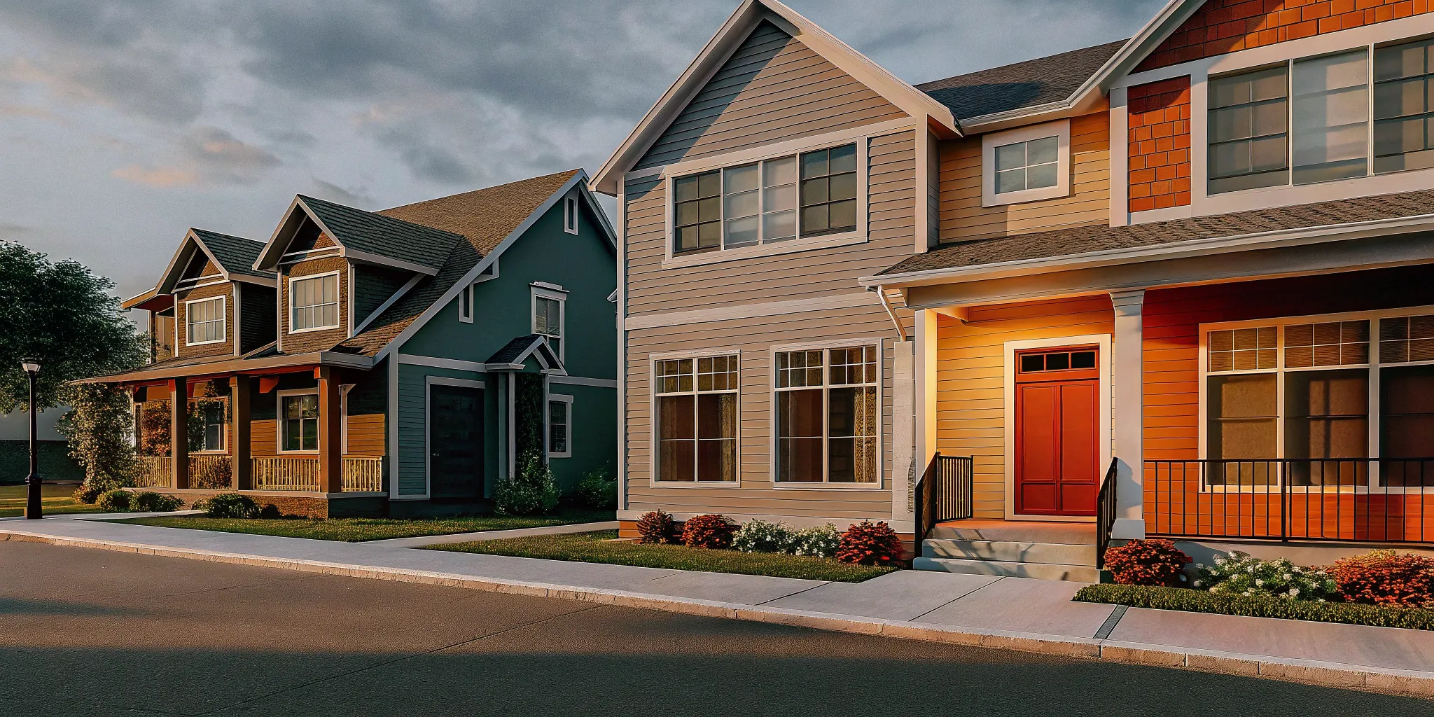
Top Paint Colors for Maximum Curb Appeal
Great curb appeal is all about creating a positive first impression, and your exterior paint color is the main event. Choosing the right palette can do more than just make your home look attractive—it can even help it sell for more money down the line. The most successful exterior color schemes are simple and cohesive, typically using three to four colors. This includes a primary color for the body of the house, a secondary color for the trim, and an accent color for the front door or shutters. This balanced approach creates a polished look that feels intentional and well-designed.
To achieve a look with broad appeal, it’s wise to choose colors that harmonize with the fixed elements of your home, like your roof shingles, brick, or stone accents. Tried-and-true neutrals are often the safest and most effective choice. According to paint experts at Benjamin Moore, some of the best choices for curb appeal include versatile neutrals like White Dove (a clean, soft white), Revere Pewter (a warm gray or “greige”), and Coventry Gray (a classic medium gray). These colors create a beautiful, welcoming facade that provides a perfect canvas for landscaping and personal touches, ensuring your home looks its absolute best from the street.
Does Paint Finish Really Change the Color?
Choosing your exterior paint color is a huge step, but the decision doesn’t end there. The paint’s finish, or sheen, plays a massive role in the final look. Think of it as the final filter on your photo—it can subtly or dramatically change the outcome. The amount of sheen determines how much light the paint reflects. A shinier finish will reflect more light, making a color appear brighter and more vibrant, while a flatter finish will absorb light, giving the same color a more muted and subtle feel.
Beyond just aesthetics, the finish also impacts the paint’s durability and how easy it is to clean. A high-gloss finish on a front door can handle fingerprints and wipe downs with ease, while a matte finish on your siding can help hide minor imperfections in the surface. Understanding these differences is key to creating a beautiful and lasting exterior. As part of our design and build services, we always walk homeowners through these choices to ensure the final result is exactly what they envisioned. Let’s break down the most common finishes so you can pick the perfect one for your home.
The Understated Look of a Matte Finish
A matte finish has no shine, giving your home’s exterior a flat, non-reflective, and velvety look. Because it absorbs light rather than reflecting it, this finish is fantastic at hiding surface imperfections like bumps, dents, or uneven texture on siding. This can give your home a very uniform and sophisticated appearance. The downside? Matte paint is more porous than its shinier counterparts, which means it’s more susceptible to staining and can be tougher to clean. While it provides a classic and elegant look, it’s best used on low-traffic surfaces like the main body of your house, rather than on trim or doors that get a lot of contact.
The Everyday Versatility of a Satin Finish
If you’re looking for the perfect middle ground, a satin finish is likely your answer. It has a soft, subtle sheen that’s often described as having a low-level glow. This finish offers the best of both worlds: it’s durable and easier to clean than a matte finish, but it doesn’t have the high shine of a gloss. The slight reflectivity helps make colors appear richer and more vibrant without highlighting every minor flaw on the surface. This versatility makes satin a popular choice for almost any exterior surface, including siding, trim, and shutters. It strikes a great balance between matte and gloss, giving you a sophisticated look that’s also incredibly practical for everyday life.
The High-Impact Shine of a Gloss Finish
For a bold, high-impact statement, a gloss finish is the way to go. This finish is highly reflective and shiny, which makes colors appear brighter and more saturated. It’s perfect for drawing attention to your home’s best architectural features, like an ornate front door, window trim, or decorative molding. Because gloss finishes are so reflective and durable, they create a hard, slick surface that is incredibly resistant to moisture and easy to wipe clean. The one major consideration is that this high shine will accentuate any and all imperfections on the surface beneath it. Meticulous prep work is essential, but the polished, eye-catching result is often well worth the effort.
How to Choose the Right Exterior Paint Color
Picking an exterior paint color is a big commitment. It defines your home’s personality and can impact everything from curb appeal to your energy bills. While it’s tempting to just go with your favorite color, there are a few key factors to think about to make sure you land on a choice you’ll love for years to come. Considering your local climate, your home’s architecture, and even your neighborhood’s vibe will help you find the perfect palette. A thoughtful approach ensures your new paint job not only looks fantastic but also protects your home and fits its surroundings beautifully.
Factor in Your Local Climate
Here in Chicagoland, our homes face it all: hot, humid summers and freezing, snowy winters. Your exterior paint is your home’s first line of defense, so you need a product that can stand up to the elements. High-quality paints are specifically formulated to be durable and resist fading, cracking, peeling, and mildew, even in tough weather. Investing in a premium paint job means you won’t have to worry about re-painting every few years. It’s less about the color and more about the quality of the paint itself, ensuring your home stays protected and looks fresh no matter what the season throws at it.
Complement Your Home’s Architecture
The best color choice will complement your home’s unique architectural features, not fight against them. A classic Colonial, for example, looks stunning in timeless whites, blues, and grays, while a modern home can handle bold, dramatic hues. Take a moment to consider your home’s materials—do you have brick, stone, or vinyl siding? These fixed elements should guide your color selection. You can find plenty of inspiration by looking at how different colors work on various home styles in our project gallery. The goal is to choose a color that feels authentic to your home’s design and your personal taste.
Consider Your Neighborhood’s Vibe
While your home is your own, it’s also part of a larger community. Take a walk around your block and notice the color schemes. You don’t have to match your neighbors, but choosing a color that harmonizes with the general aesthetic can improve the look of the whole street. The right exterior color is incredibly important, as it affects your home’s value and how welcoming it feels. If you live in a community with a homeowners association (HOA), be sure to check their guidelines before you start painting, as they may have a pre-approved list of colors.
How Color Can Affect Your Energy Bill
Did you know your paint color can impact your home’s temperature? Dark colors absorb more heat, while lighter colors reflect it. This is especially important for any sides of your house that get a lot of direct sun. A lighter shade can help keep your home cooler in the summer, which might even lead to lower air conditioning costs. Plus, the way light hits your house changes how paint colors look throughout the day. A color that looks perfect in the morning might feel completely different in the afternoon. It’s always a good idea to test samples on different walls to see how they appear in the morning sun versus the evening shade.
Managing Heat with Dark Colors and Good Insulation
So, if you’re dreaming of a dramatic, dark exterior, don’t let the fear of a higher energy bill stop you. While dark colors do absorb more heat, a well-insulated home can easily manage the difference. Think of high-quality insulation as your home’s secret weapon—it creates a strong thermal barrier that prevents outdoor heat from seeping into your living spaces. This means that even if your siding gets warm on a sunny day, your interior stays cool and comfortable. During a comprehensive home renovation, addressing the building envelope is key to ensuring long-term efficiency and comfort. With the right insulation in place, you can confidently choose the color you love without having to sacrifice performance.
The Best Exterior Colors for Your Home’s Style
Your home’s architectural style is one of the best guides you have when choosing an exterior paint color. The right palette won’t just look good; it will honor the design, highlight unique features, and feel like a natural extension of your home’s character. A thoughtful color choice is a key part of any home renovation, setting the tone for the entire project. It’s the first thing people see, and it can completely change the way you feel about pulling into your driveway.
Choosing a color can feel overwhelming with so many options available, but starting with your home’s style narrows down the choices significantly. This approach ensures the final result feels cohesive and intentional, rather than trendy for the sake of being trendy. For example, the colors that work on a historic brick two-flat in Lincoln Park will be very different from what suits a sprawling ranch in the suburbs. Understanding the bones of your house helps you make a choice that you’ll love for years to come. Whether you live in a classic Chicagoland Colonial, a sleek modern build, or a cozy Craftsman, there’s a color scheme that will make it shine. Let’s look at some popular styles and the colors that suit them best.
For Traditional & Colonial Homes
If you have a traditional or Colonial home, the goal is to lean into its timeless charm. Classic colors are your best friend here, helping to maintain the home’s historical feel. You can’t go wrong with crisp whites like Benjamin Moore’s Simply White or the slightly softer White Dove. These shades provide a clean, elegant backdrop that always looks right. For a touch of color that still feels authentic, consider muted blues or soft grays. These hues add a layer of sophistication and work beautifully with the classic lines of Colonial architecture. Exploring these classic paint colors can help your home blend gracefully with its surroundings while still feeling fresh.
For Modern & Contemporary Homes
Modern and contemporary homes are all about clean lines and innovative design, which gives you more freedom to play with color. While neutrals are always an option, these styles can handle bolder, more dramatic shades. Think about a striking navy blue or a deep charcoal gray to create a powerful contrast against crisp white or metallic trim. This approach really makes the home’s architectural features pop. The key is to make a statement without overwhelming the design. Choosing a bold color palette is about finding a balance that feels both intentional and harmonious with the home’s modern aesthetic.
For Craftsman & Cottage-Style Homes
Craftsman and cottage-style homes are known for their cozy, inviting feel and connection to nature, so earthy tones are a perfect match. Think about colors that you’d find in the natural world: warm browns, soft sage greens, and muted yellows. These shades enhance the handcrafted details and natural wood elements common in Craftsman architecture. For example, a lovely sage green can make wood trim look even richer. Don’t be afraid to use a few different colors to create a cohesive look. Using complementary shades for the trim, siding, and accents can highlight the home’s unique character and create some truly appealing color palettes.
Why Lighting Is Everything for Your Paint Color
Have you ever picked out a paint chip in the store, absolutely loved it, only to find it looks completely different on your wall? Now, imagine that happening on the entire exterior of your house. The single most influential factor in how a paint color looks is lighting. The same shade of gray can look cool and crisp in the morning, warm and beige at noon, and almost purple at dusk. Understanding how light interacts with your home is the secret to choosing a color you’ll love at all hours of the day, all year long.
The direction your home faces, the amount of shade from trees, and even the season will dramatically alter a color’s appearance. That’s why simply holding a small swatch up to your siding isn’t enough. To truly get it right, you need to see how your top color contenders perform in their real-world environment. This step ensures the vision you have for your home’s exterior becomes a reality, creating a beautiful and cohesive look that complements its surroundings. A thoughtful color choice is a hallmark of a well-executed home renovation.
How Daylight Changes Your Color
The quality of natural light changes constantly, and your paint color will change right along with it. The soft, clear light of early morning has a different color temperature than the intense, direct sun of midday or the warm, golden glow of late afternoon. A color that looks perfect in the bright afternoon sun might feel dull or washed out in the softer morning light.
The direction your home faces also plays a huge role. North-facing walls receive indirect light, which can bring out the cool undertones in a color. In contrast, south-facing walls get intense, direct sun for most of the day, which can make colors appear much brighter and warmer. Before you even pick up a paint chip, spend a day observing how the light moves across your home. This will give you a much better sense of which color families will work best.
How Seasons Affect Your Siding
Just as light changes throughout the day, it also shifts with the seasons. The sun sits lower in the sky during the winter, casting longer shadows and producing a cooler, weaker light. In the summer, the high, intense sun can make colors appear more vibrant and saturated. A deep, moody blue that looks stunning against a snowy winter landscape might feel overwhelmingly bright during a sunny July afternoon.
Your home’s surroundings also impact the color. The lush green foliage of summer can cast a subtle green tint onto your siding, while the bare branches of winter won’t. When choosing a color, think about how it will harmonize with your home’s permanent features—like the roof, trim, and any brick or stone accents—throughout the entire year. A truly great exterior color scheme looks intentional and beautiful no matter the season, something our design and build services always aim for.
The Right Way to Test Paint Samples
The best way to avoid a costly color mistake is to test your top choices properly. Instead of painting small swatches directly onto your siding (where the current color can alter your perception), paint large samples on white foam boards. This allows you to see the true color without interference.
Move these sample boards around to different sides of your house throughout the day. Check them in the morning, at noon, and in the late afternoon. Don’t forget to observe them on both a bright, sunny day and a gray, overcast day, as the color can look dramatically different in each scenario. This process might seem tedious, but it’s the only way to be completely confident in your decision before the painters arrive. It’s a critical step for ensuring your final choice enhances your home’s best features, which you can see in our project gallery.
Helpful Tools for Visualizing Your New Exterior
Even after you’ve tested paint samples, it can still be tough to picture how a color will look across your entire home. That tiny swatch represents a huge surface area, and it’s a big leap of faith to go from a small square to a full-scale exterior. Luckily, you don’t have to rely solely on your imagination. There are some fantastic digital tools that can help you visualize the final result before you even buy the first can of paint. These resources are perfect for experimenting with different palettes, confirming your top choices, and feeling confident in your decision. Using them is a key step in the planning phase of any successful home renovation, helping to bridge the gap between idea and reality.
Use a Paint Color Visualizer
One of the best ways to take the guesswork out of choosing a color is to use an online visualizer. Most major paint brands offer one, and they are incredibly easy to use. For example, the Sherwin-Williams Paint Color Visualizer tool lets you upload a photo of your own house and digitally “paint” it with any of their colors. This is a game-changer because you can see how different shades look on your specific home, with its unique roofline, trim, and landscaping. You can try out that bold navy you were curious about or compare three different shades of greige side-by-side. It’s a risk-free way to experiment and helps you make a much more informed decision, ensuring the final look is exactly what you hoped for.
Find Inspiration on Social Media
Sometimes the best inspiration comes from seeing what real homeowners are doing. Social media platforms like Instagram and Pinterest are visual treasure troves for exterior paint ideas. Instead of just looking at perfectly styled brand photos, you can see how colors look in different lighting conditions on actual homes. A great trick is to search for hashtags related to specific paint colors. For instance, Sherwin-Williams encourages users to share photos with the hashtag #SWColorLove, creating a massive gallery of real-world examples. You can also search for your home’s architectural style (like #colonialhome or #craftsmanexterior) to see what color palettes others have used successfully. It’s a fantastic way to gather ideas and discover new combinations you might not have considered otherwise.
Common Exterior Paint Mistakes (and How to Avoid Them)
Choosing an exterior paint color feels like a huge commitment, and it is! The right color can transform your home, while the wrong one can be a costly and frustrating mistake. After years of helping homeowners through full home renovations, we’ve seen a few common missteps that can easily be sidestepped. Taking a little extra time to plan and test will ensure you land on a color you’ll love for years to come. Let’s walk through the most frequent paint-picking mistakes and how you can steer clear of them for a beautiful, lasting finish.
Mistake #1: Skipping the Sample Test
Grabbing a few paint chips from the store and holding them up to your siding is a start, but it’s not nearly enough to make a final decision. A color can look completely different in the store’s fluorescent lighting than it does in the morning sun. Instead of painting test swatches directly on your wall, which can be hard to cover up, paint them on a large white foam board. This allows you to move the sample around your home’s exterior. Check it on different walls and at various times of the day—morning, noon, and late afternoon—to see how the changing light affects the hue. This simple step gives you the most accurate preview of the final result.
Mistake #2: Ignoring Your Roof and Trim
Your home’s exterior isn’t a blank canvas. It has fixed elements with their own colors and textures that you need to work with, not against. Always consider the color of your roof, any brick or stone accents, your window trim, and even your landscaping. A beautiful gray paint might look perfect on a sample board, but it could clash horribly with a warm-toned brown roof. The goal is to create a harmonious look where the paint complements these existing features. A cohesive palette is key to great curb appeal, something our design and build team focuses on in every project.
Mistake #3: Using Too Many Colors
While it can be tempting to create a unique, multi-colored masterpiece, a busy color scheme can often look chaotic rather than curated. Most homes look best with a palette of three to four colors. This typically includes a primary color for the main body, a secondary color for the trim, and an accent color for the front door or shutters. Sticking to a more limited palette creates a sophisticated and intentional look. If you want to add more personality, focus on a bold front door color or unique landscaping rather than adding another color to your siding.
Mistake #4: Forcing a Trend That Doesn’t Fit
It’s fun to see what exterior colors are trending, but a popular shade won’t automatically work for your house. The most important factors are your home’s architectural style and its surrounding environment. A sleek, dark gray might look stunning on a modern home but feel out of place on a classic Colonial. While neutrals are still popular for their timeless appeal, the best color is one that honors your home’s character. Your exterior paint is a long-term investment that affects your home’s value and feel, so choose a color that you’ll be happy with long after the trend has passed.
Mistake #5: Underestimating the Impact of a Poor Paint Job
It can be tempting to cut costs by choosing cheaper paint or a less experienced painter, but this is one area where saving money upfront can cost you dearly. A poor paint job does more than just look bad—it can actively detract from your home’s value. Streaks, drips, and peeling paint send a message of neglect and can make your entire property look cheap, ruining that critical first impression. Beyond aesthetics, a high-quality paint job acts as a crucial protective barrier against Chicagoland’s harsh weather. An inferior application won’t properly shield your siding from moisture and sun, leading to faster deterioration and the need to repaint much sooner. Investing in professional work ensures your home is not only beautiful but also well-protected for years to come.
How to Create a Cohesive Exterior Color Scheme
Now for the fun part: putting it all together. A great exterior color scheme is more than just one color; it’s a thoughtful combination of hues that work together to create a beautiful, cohesive look. Typically, a scheme includes three main components: the field color (the dominant color on your siding), the trim color (for window frames, fascia, and roof edges), and the accent color (for doors, shutters, and other details).
Choosing the right combination can feel like a big decision, but it’s also where you can get creative and truly personalize your home. The goal is to select colors that complement your home’s architecture, reflect your personal style, and fit into your neighborhood’s aesthetic. Think about the permanent elements of your home, like brick or stone accents, roofing material, and even your landscaping. These features have their own colors and textures that should inform your paint choices. A well-designed color scheme will harmonize with these existing elements, not fight against them. Whether you prefer a subtle, elegant look or something bold and eye-catching, there’s a strategy that will work for you. You can see how these elements come together by looking through a gallery of completed projects to find inspiration for your own home.
The Monochromatic Approach
If you’re aiming for a sophisticated and harmonious look, a monochromatic scheme is a fantastic choice. This approach uses different shades, tones, and tints of a single color to create a layered, cohesive feel. A monochromatic scheme can create a sophisticated and cohesive look, allowing different shades of the same color to add depth and interest. For example, you could paint your siding a medium gray, use a darker charcoal gray for the trim, and highlight architectural details with a soft, light gray. This creates a clean, modern, and timeless aesthetic that works beautifully on a variety of home styles. It’s an elegant way to add dimension while maintaining a unified appearance.
Working with Complementary Colors
For a more dynamic and striking look, consider using complementary colors. These are colors that sit opposite each other on the color wheel, and pairing them creates a strong visual contrast that makes your home stand out. Complementary color pairings can create a striking visual impact. A classic example is using a bright, contrasting color for trim, like a crisp white against a deep blue or dark gray siding. This technique is perfect for highlighting your home’s best architectural features, making them pop. This approach brings energy and life to your exterior and is a great way to achieve a memorable, high-impact design.
Choosing Accents for Trim, Doors, and Shutters
Your accent color is where you can inject a dose of personality into your home’s exterior. This is the color you’ll use on your front door, shutters, and other small architectural details. Accent colors are essential for adding character and can be used strategically to highlight architectural features. You could paint your front door a bold red, a cheerful yellow, or a calming blue to create a welcoming focal point. You can match your shutter color to your front door or choose a slightly lighter or darker shade for a different look. Just remember that the way light hits your house changes how paint colors look, so be sure to test your accent color in different lighting conditions before committing.
Inspiring Exterior Color Combinations
Once you understand the basic principles of creating a color scheme, you can start exploring specific combinations. The right palette can make your home feel welcoming, sophisticated, or grounded in nature. It’s all about finding the combination that reflects your personal style while complementing your home’s architecture. Whether you’re drawn to timeless classics or more modern, moody hues, there are endless possibilities. Let’s look at a few tried-and-true approaches to help you find the perfect color story for your home’s exterior.
Classic Main, Trim, and Accent Palettes
The most common and effective approach is to build a palette with three distinct colors. This includes a main color for the body of the house, a trim color for windows and eaves, and an accent color for the front door or shutters. This simple formula creates a balanced and polished look that instantly improves curb appeal. For example, you could pair a soft greige siding with crisp white trim and a deep navy blue front door. This creates visual interest without feeling overwhelming. A cohesive palette is key to a beautiful exterior, ensuring all the elements work together harmoniously.
Color Pairings to Set a Mood
Your home’s exterior color is one of the first things that sets a mood for visitors. If you want to create a dramatic, sophisticated feel, consider leaning into the trend of using darker colors for the entire exterior. Shades like charcoal gray, deep navy, and even black are no longer just for accents; they create a powerful and modern statement. For a more grounded and serene vibe, earthy tones are a fantastic choice. Colors like olive green, warm terracotta, and muted forest greens help connect your home to its natural surroundings, creating a look that feels both stylish and calming.
Color Palettes for Good Energy
Choosing the right exterior colors can make your home feel more welcoming and improve its overall energy. Different palettes can create different moods, from cheerful and bright to calm and connected to nature. If you’re planning a home renovation with resale value in mind, certain colors have a broad appeal that can make your home more attractive to potential buyers. Timeless neutrals are always a safe and stylish bet. According to paint experts, top choices include Benjamin Moore’s White Dove (a clean, soft white), Revere Pewter (a versatile warm gray), and Coventry Gray (a classic mid-tone gray). These colors create a beautiful, inviting canvas that allows your home’s best features to shine.
How to Get High-Quality Exterior Paint for Less
A fresh coat of high-quality paint is one of the best investments you can make in your home’s curb appeal and protection. But premium paint comes with a premium price tag. The good news is you rarely have to pay full price. With a little planning, you can get the best brands for much less. It’s all about knowing where and when to look for deals. From holiday sales to loyalty programs, there are plenty of ways to cut costs without compromising on the quality your home deserves. Here are a few of the most effective strategies for saving money on your next exterior paint project.
Shop the Seasonal Sales
Timing is everything when it comes to buying paint. Big-box stores and paint retailers often run major sales around holiday weekends like Memorial Day, the Fourth of July, and Labor Day. These are perfect times to stock up for your project. It’s not uncommon to find deals that take a significant percentage off your total purchase. For instance, many homeowners find great weekend sales that can slash prices by up to 40% on top-tier brands. Planning your project around these promotions can make your budget stretch further.
Look for Manufacturer Rebates
Another great way to save is by going directly to the source. Paint manufacturers frequently offer mail-in or online rebates that can put money back in your pocket after your purchase. Brands like Behr consistently provide rebates on their purchases, especially when you buy multiple gallons. Before heading to the store, take a few minutes to check the websites of your preferred paint brands. You might find a special offer that your local retailer isn’t advertising, giving you an extra layer of savings.
Ask About In-Store Discounts
Don’t overlook the power of loyalty programs. Stores like The Home Depot have programs that offer exclusive discounts on painting supplies. Their Pro Xtra program, for example, provides members with rewards for purchasing paint, including up to 20% off paints, stains, and primers. While the name might sound like it’s just for contractors, these programs are often open to everyone. Signing up is usually free and can lead to immediate savings on your current project and accumulate points for future needs. It’s a simple step that can make a big difference in your budget.
Related Articles
Frequently Asked Questions
Is it really worth paying more for a premium paint brand? Absolutely. Think of exterior paint as a protective shield for your home. Premium brands like Sherwin-Williams and Benjamin Moore use higher-quality ingredients that result in better coverage, superior color retention, and much greater durability against Chicagoland’s harsh weather. While the upfront cost is higher, you’ll save in the long run by not having to repaint nearly as often.
How often should I expect to repaint my home’s exterior? The lifespan of an exterior paint job depends on the quality of the paint and the prep work, but a professionally applied, high-quality paint should last anywhere from 7 to 10 years. Factors like direct sun exposure and moisture can affect longevity, but investing in a good product from the start is the best way to extend the time between paintings.
What’s the best way to test a paint color before committing? The most reliable method is to paint a large sample on a white foam board instead of directly on your siding. This allows you to see the true color without your current exterior color influencing it. You can then move the board to different sides of your house and observe it in the morning, afternoon, and evening light to get a full sense of how it will look in all conditions.
How do I choose a trim color that works with my main siding color? A classic, can’t-miss strategy is to choose a crisp white or a soft off-white for your trim. It creates a clean, sharp contrast that makes your main color pop. If you want something less traditional, you can select a color that is a few shades lighter or darker than your main siding color. This creates a more subtle, layered look that is very sophisticated.
My house has brick or stone on it. How does that affect my color choice? Brick and stone are fixed elements, so you should treat their colors as a key part of your palette. Look closely at the undertones in the material—are they warm reds and browns, or cool grays and blues? Choose a paint color that shares a similar undertone to create a cohesive and harmonious look rather than one that clashes with these beautiful, permanent features.